Monthly Archives: March 2016

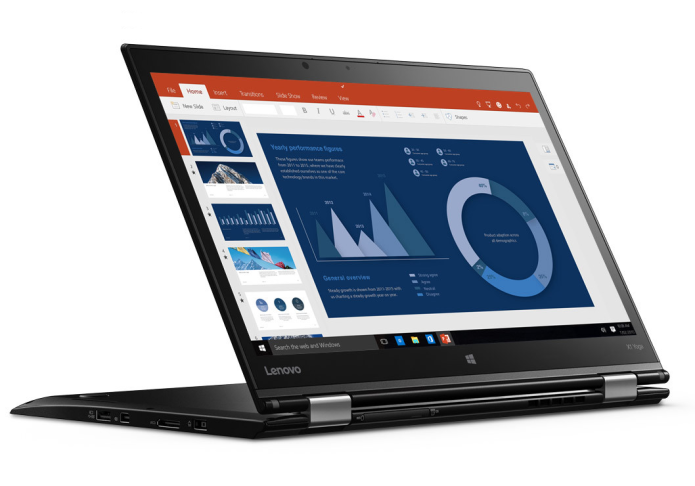
Lenovo ThinkPad X1 Yoga Review

THE PROS

Light, durable and flexible design; Excellent keyboard; Full-day battery life; Accurate stylus

THE CONS

Bottom runs warm; Below-average SSD speed on Core i5 model

VERDICT

The Lenovo ThinkPad X1 Yoga is a sleek business 2-in-1 that will last a full workday whether you’re banging out spreadsheets or drawing on the touch screen.

The Swiss Army knife of business laptops, Lenovo’s ThinkPad X1 Yoga can handle everything from light editing to heavy design work. Starting at $1,394, this 14-inch, bend-back 2-in-1 features a battery that will last a full workday, a screen with vivid colors, and a stylus for drawing and navigating Windows. We tested two configurations, one with a Core i5-6200U processor and 1080p touch screen ($1,624 as tested) and one with a Core i7-6400U processor and a 2560 x 1440 display ($1,655 as tested). In both cases, we found strong performance, long battery life and a superior productivity experience.

Design

If you want a 2-in-1 that is sleek, slim and professional, the Lenovo ThinkPad X1 is for you. Its understated black design with red accents calls attention to the job being done rather than the machine doing the work. Inside is an island-style keyboard, a trackpad and nub, a fingerprint reader, and a 1920 x 1080 touch-screen display surrounded by a thick, black bezel. A card reader is located on the back of the device, but it’s difficult to access when the X1 is in laptop mode, so you’ll want to close the laptop or switch to tent or tablet mode before using the card reader. The computer features a carbon-fiber lid and a body made from magnesium, and it feels very solid despite how light it is.

Lenovo Thinkpad X1 Yoga

At 13.11 x 9.01 x 0.66 inches and 2.8 pounds, the X1 Yoga is slightly larger than the Vaio Z Flip (12.8 x 8.5 x .66 inches) and the Lenovo ThinkPad Yoga 260 (12.20 x 8.66 x 0.70 inches) but is fractions of a pound lighter than both.

Modes

The X1 Yoga’s 360-degree hinge allows it to be used as a laptop, a tablet (when folded all the way back), a tent (in the shape of an upside-down V) or a display (with the keyboard face-down and the screen pointing towards you). When the keyboard is folded toward the back of the screen, the “Lift ‘n’ Lock” keys retract so they don’t click when you hold the machine as a tablet.

Lenovo Thinkpad X1 Yoga Stand Mode

Keyboard, Touchpad And TrackPoint

The keyboard on the ThinkPad X1 Yoga has 1.67 millimeters of travel and requires 60 grams of force to press, resulting in a comfortable typing experience, though the keys occasionally bottomed out. I typed 100 words per minute on the 10fastfingers.com test with an error rate of 1 percent, which is about average for me. Users who want an even-better keyboard should consider Lenovo’s ThinkPad Yoga 260 or ThinkPad T Series laptops, all of which have 2mm of key travel.

The 3.9 x 2.2-inch Synaptics touchpad is smooth to the touch. I comfortably navigated a series of websites while using gestures like two-finger scroll and three-finger swipe, which reveals the desktop. 

 Lenovo’s TrackPoint nub is located in the center of the keyboard amidst the G, H and B keys, and lets you navigate around the desktop very accurately, without moving your hands off the home row.

Lenovo Thinkpad X1 Yoga keyboard

Stylus

The right side of the X1 Yoga houses a rechargeable stylus, which is great for when the device is in tablet mode. I gave the laptop and stylus to our in-house artist, who was impressed by the Yoga’s palm rejection, accuracy and speed, which easily matched his strokes.

The stylus is a little thin and short — something like the Apple Pencil is more ergonomically friendly — but it fits into the notebook for easy storage and charging. Lenovo claims that just 15 seconds of charging will provide up to 100 minutes of continuous use.

We were impressed by the Yoga’s palm rejection accuracy and speed.

Lenovo’s WRITEit app allows you to handwrite directly into any text field in any app, rather than using Windows 10’s handwriting keyboard, which sits at the bottom of the screen. I found that this app had some trouble with my handwriting, but our artist had better luck.

Lenovo Thinkpad X1 Yoga writeit app

Handwriting recognition worked well for me in WordPad, where I could write without size restrictions. The Wacom pen tool is on board to calibrate your pen and assign commands to the pen’s two buttons.

Display

The 14-inch touch screen on the X1 Yoga comes in two flavors. Our Core i5 model had a 1080p display, while the Core i7 config we tested had a sharper, 2560 x 1440 QHD panel. When I watched the trailer for Ghostbusters, the QHD display was sharper, showing more wrinkles in a ghost’s face as it flew toward the screen. But this display  was warmer than the 1080p version, which had better white balance with more-accurate skin tones.

The trailer seemed a bit dim on the 1080p display, especially during indoor scenes, like one in which Kristen Wiig explores a wig closet just to be spooked by Kate McKinnon. In the scene, McKinnon’s wig is engulfed in part by shadow, appearing black instead of purple. Still, the brightest colors and sharp details overcame the dimness, and outdoor scenes and the spectral auras coming from ghosts managed to pop. The spirits appeared brighter on the QHD screen, but they also didn’t look as good with the screen’s warm tint. Both screens had strong viewing angles and were clear at 45 degrees, starting to wash out only at around 80 degrees.

The design calls attention to the job being done rather than the machine doing the work.

The 1080p display registered 279.2 nits of brightness, and the QHD model displayed 268 nits, both significantly dimmer than the Yoga 260 (328 nits) and the Vaio Z Flip (346 nits).

Colors are vivid and accurate on the 1080p model; the X1 Yoga reproduces an excellent 102 percent of the sRGB color gamut and has a Delta-E accuracy score of 0.55 (the closer to zero, the better). On the QHD display, it covers a larger degree of the gamut (109.3 percent) but is less accurate, with a Delta-E score of 1.02.

Durability And Security

If you keep your data under lock and key, you’ll appreciate the fingerprint reader located on the right side of the palm rest. Many laptops require you to swipe your finger over the reader, but the one on the ThinkPad X1 Yoga requires only a quick touch.

I found this to be easier and more accurate than other fingerprint readers I’ve used in the past. In addition, the X1 Yoga uses Trusted Platform Module (TPM) technology to encrypt your data and keep it secure.

Lenovo claims that the laptop passes MIL-STD 810G durability tests required for government and military use, including being able to stand up to bumps, drops, dust and extreme temperatures. Additionally, the company says the keyboard is spill-resistant and should be able to keep on working should you spill a drink on it.

Audio

Lenovo Thinkpad X1 Yoga Audio

I was surprised when the tiny speakers on the X1 Yoga filled my apartment with the loud, soulful sound of The Weeknd’s “I Love It.” I did find that the music could have an echo-y, hollow mix that buried the vocals. But when I opened the Dolby Audio app and switched to the Dynamic preset, which makes changes based on what you’re playing, the song sounded much better. The music was muffled when I used the laptop on my lap, but sounded fine when the device was on a table or in tent, tablet or stand modes.

Performance

Whether you’re using it as a laptop or a tablet, the ThinkPad X1 Yoga and its Core i7-6500U processor, 8GB of RAM and 512GB SSD will be a capable workhorse. I ran Google Chrome and a text editor and didn’t see any lag until I had 10 tabs open in the browser, one of which was streaming 1080p video from YouTube (the Core i5-6200U lagged with eight tabs open).

On the Geekbench 3 test, which measures overall performance, the Core i7 X1 Yoga achieved a score of 7,063 and the i5 version scored 6,465. Both of those marks trailed the Vaio Z Flip’s Core i5-6267U (7,235), but defeated the Core i5-6200U in the ThinkPad Yoga 260 (6,027). All of the machines blew past the category average score of 4,972.

The ThinkPad X1 Yoga transferred 4.97GB of mixed-media files in 27 seconds, a rate of 186.2 MBps (the i5 version was slower, at 143.4 MBps). This was faster than the ThinkPad 260’s mark of 130.5 MBps, while the Vaio Z raced past them both, with a showing of 391.5 MBps. The category average is 160 MBps.

The X1 Yoga took 4 minutes and 30 seconds to pair 20,000 names and addresses in OpenOffice, which is slightly faster than the ThinkPad Yoga 260 (4:42) but behind the Vaio Z Flip (3:47).

The integrated Intel HD Graphics 520 chip isn’t powerful enough for you to play intense games like Far Cry Primal or Fallout 4. While the X1 Yoga’s 3DMark score of 63,098 is impressive, it doesn’t come near the Vaio Z’s showing of 89,876.

Ports And Webcam

The ThinkPad X1 Yoga has plenty of ports for your peripherals and monitors. On the right side are two USB 3.0 ports, an HDMI port, a Kensington lock slot and a headphone/microphone combination jack. The left side is where you will find the power port, Onelink+ port for docking, mini DisplayPort and another USB 3.0 port. On the back of the laptop is a compartment to place a SIM card and an SD card.

Lenovo Thinkpad X1 Yoga Webcam

I took a selfie in our well-lit labs and found that while the color in my blue sweater and T-shirt were accurate, the camera didn’t capture a lot of detail, such as that in my hair and beard, which appeared blurry and watery. The light coming in through some windows behind me was completely blown out, but darker parts of the background were more properly exposed.

Battery Life

You’ll be able to use the Core i5 ThinkPad X1 Yoga during your 9-to-5 routine without having to charge the device. The 1920 x 1080 version of the notebook lasted 8 hours and 38 minutes on the Laptop Mag Battery Test, which involves continuous Internet browsing over Wi-Fi at 100 nits, but the 2560 x 1440 model lasted for a bit less, coming in at 7:52. Both laptops outlasted the ThinkPad Yoga 260’s time of 7:46, though only the Core i5 model lasted longer than the category average of 8:11. The Vaio Z lasted the longest of the field, coming in at 9:04. 

Heat

The ThinkPad X1 Yoga can get warm, but it’s not too hot to handle. After streaming 15 minutes of video from Hulu, the bottom of the Core i7 version of the machine reached 101 degrees and the Core i5 version hit 96 degrees, both above our comfort threshold of 95 degrees. The touchpad stayed cool, at 82.5 degrees on the i7 version and 78.5 degrees on the i5 model, while the center of the keyboard hit 87 and 90 degrees on the two versions, respectively.

Software And Warranty

The X1 Yoga comes with a small combination of productivity software and distracting bloatware. In addition to WRITEit and Dolby Audio, the most helpful application is Lenovo Companion, which makes it easy to install system updates and clean your PC. The bloat includes Flipboard, Twitter and the ever-present Candy Crush Soda Saga, the last of which really has no place on a business notebook.

Lenovo offers a one-year warranty on the ThinkPad X1 Yoga. When I plugged our review unit’s serial number into the company’s Web site, I was offered a set of extension options. This included a two-year warranty for $69 and a three-year warranty for $109, as well as a number of longer warranties, coverage for specific parts and accidental-damage protection.

Configurations

We reviewed two versions of the ThinkPad X1 Yoga. The first came with a Core i5-6200U CPU, 8GB of RAM, 256GB of storage and a 1080p touch screen, all for $1,624. The second had a Core i7-6500U CPU, 8GB of RAM, 512GB of storage and a 2560 x 1440 display, all for $1,655

For $1,394, the base model comes with the same specs with the exception of a 128GB SSD. A model with a Core i7 processor, 16GB of RAM and a 512GB SSD sells for $1,983. The Core i5, 1080p model we reviewed strikes a balance among power, storage and performance, and we recommend that you configure yours in a similar manner if you can.

Later this year, Lenovo will offer a configuration of the ThinkPad X1 Yoga with a colorful OLED screen.

Bottom Line

The ThinkPad X1 Yoga is a versatile business 2-in-1 that will last all day and give you plenty of power to be productive. We particularly appreciate the WRITEit software and stylus that make Windows 10 more useful in tablet mode. If you want to save a little money, Lenovo’s 12.5-inch ThinkPad Yoga 260 starts at just $989 and provides deeper key travel, but has a less colorful display and no 2560 x 1440. However, if you want the top-of-the-line business 2-in-1, the X1 Yoga is your best choice.

(laptopmag.com)

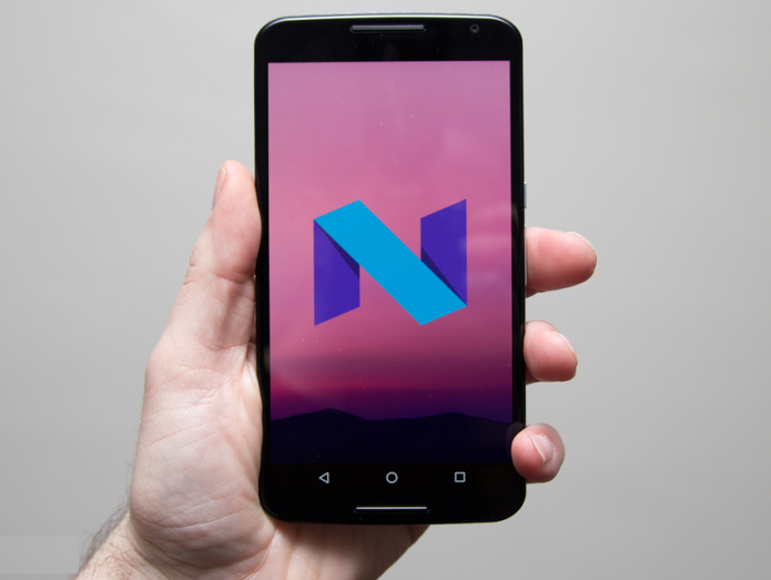
Android N: Everything you need to know about Android 7.0

Android has been making some big moves recently, redesigning and adding functionality to the mobile operating system to make it more capable and more competitive.

With the advent of Lollipop, Android moved to a state that felt like it was complete. It had polish that rivalled manufacturer skins, a maturity to apps that made them wonderful to use.

That was cemented with refinement in Marshmallow that saw many manufacturers moving to accommodate Android’s native charms, rather than stomp all over them.

Anticipation is high for Android N and in an uncharacteristic move, Google has released a developer build of Android N into the wild much earlier than expected. We’ve been playing with the future version of Android see what’s changing, what’s new and what we can expect come launch day.

This is Android N and this is everything you need to know.

Android N has been revealed much earlier than it has in the past, with a preview version of Android N made available by Google on 9 March.

In the past the first glimpse of the next version of Android has been at Google I/O. This is Google’s developer conference opening this year on 18 May 2016. We’re expecting to see a lot more of Android N at Google I/O but this time armed with some knowledge about what it can do.

Google has already said that the final preview version of Android N will be ready by the summer, so well in advance of previous years.

The final consumer version of Android N won’t land until later in the year however, usually around October. This is typically timed with the release of anew Nexus handset, making the debut of the new Android version, but perhaps the earlier preview suggests an earlier release of the next Nexus.

The roll-out of Android N to other devices usually then follows, hitting existingNexus hardware within a few weeks, but often taking several months to be incorporated into other devices. Want Android N on your Samsung Galaxy S7? You’ll probably be waiting until March 2017.

phpivo7yb copy

Google names its Android versions after sweet treats. That’s run on for years, recently taking in Kit Kat, Lollipop and Marshmallow. So what will be the name of Android 7.0?

The naming of the next version of Android might come down to an online poll: Google SVP Sundar Pichai recently told students at Delhi University that it might be down to the fans to decide.

But Google is already having fun with the speculation: writing in a Medium post, Hiroshi Lockheimer, SVP Android at Google, pokes fun, saying: “So, the burning question that’s on everyone’s mind: what will the N release be named? We’re nut tellin’ you yet.” You can expect a lot more of this sort of stuff until the final reveal and unveiling of a new lawn figure at Google HQ.

One of the important differences in the early days of Android N compared to previous versions is that it’s incredibly easy to get. Google has opened up a the Android Beat Program that means you can simply enrol a device and have the update delivered over the air.

In previous versions you’ve been invited to download the software and manually flash it to your device. The big difference this makes is that Android Nis much more accessible and you can load it onto a Nexus or Pixel device without losing all the content.

Regular updates are expected to follow, in the same fashion as Microsoft ran the Windows Insider Program. If you’ve got a supported handset that’s spare, you can take a look at what’s to come. We’ve written all about getting involved in the Windows Beta Program in a separate feature.

Thanks to the release of the Android N preview, we now have plenty of information about what Android N might look like when it lands on a consumer device later in the year.

One thing to bear in mind with beta previews is that they are subject to change. The whole point of these preview programmes is that developers can feedback information and Google can evaluate which features are ready to be released. Some of what we see here may change over time, may not make the final release, or could be a rock solid feature.

It’s also worth bearing in mind that Google often keeps something in reserve. There is likely to be big headline feature that’s left as a surprise for launch day.

We’re still exploring some of the things that the Android N preview offers, so we’re updating this feature as we get to the bottom of things. There are some things we’re not looking at here. Doze, for example, is reported to be much more enhanced, allowing apps to sleep whenever the display is in standby, not just when the device is inactive. There’s also picture-in-picture for Android TV coming.

Screenshot_20160310-170240

The notifications pane and quick settings go hand-in-hand because they occupy that same space at the top of your display. Swiping down now reveals a pane that spans the entire width of your display, a slight change in the visual design from Lollipop and Marshmallow that followed the card theme.

Quick settings now occupies a smaller bar at the top, carrying the icons for those quick settings, but with no labels or anything else. You’re just expected to know what they mean and that’s fair enough – as these are quick settings, you’re likely to know what they’re there for. What’s different is that a single swipe gives you a number of settings. On the Nexus 6 that’s five icons, with a drop down arrow to expand the quick settings area to the full pane. One omission is the shortcut to the full settings menu, which sits at the top of the page all the time in Marshmallow.

The full quick settings pane is similar to the current offering in Marshmallow, offering a brightness slider and nine icons, but here they flow over the page and offer up an edit function. This will let you drag options around so you can choose what you see where. It’s very simple and somewhat overdue.

There are no drop down options on things like Wi-Fi or Bluetooth here, but with a tap you get a neat overlay menu – a little like the do not disturb pane in Marshmallow. Tap the battery, for example, and an overlay pops up with a graph and your estimated time left. Tap Bluetooth and it will show paired devices that are available. In both cases, a long press will take you through to those sections in the settings menu. This means more options for less space and a cleaner UI, which we’re all for.

There’s a neat animation that sees the top quick settings you get on the first swipe shifting location to reveal the full set.

Screenshot_20160310-203858

The settings menu has had a makeover, removing some of the division bars and bubbling up more information. When you open up the settings menu, you’re now faced with a bit more information. The new N arrangement makes Marshmallow look at little sparse, so this is a change we like.

One of the interesting elements is that there’s now a status banner at the top of the page, perhaps to let you know what’s going on if you’re heading in to the settings to change something. If you’re in data saving mode, that’s labelled here, as is do not disturb. If you were heading in to fix something like not getting updates or alerts, there’s now that quick option at the top to turn those major device behaviour features off.

There’s also a suggestions bar. If you don’t have security set-up on your device, it’s here that Android will suggest you do something about it. At the moment it’s difficult to know what the range of suggestions will be – but rather like theBlackBerry Priv with its suggestions from DTEK, perhaps this is Android looking to guide users a little more around things like security.

Otherwise the settings menu is laid out using the same sort of icons as it was before and in the same sort of arrangement. But as we said, there’s more information, so you don’t have to go digging. We can see at a glance that on this test device, there’s 74 apps installed, we’re using 7GB of storage, the battery will last for another day and so on. There’s no diving in and out of areas, because this information is all there at a glance.

However, there’s a new navigation option for settings. Once you’re in an area – like Bluetooth for example – you get a side menu. This will let you jump to any area of the settings quickly. We can’t really see that it’s that useful at the moment, as hitting back to return to the top level isn’t that tricky.

Screenshot_20160310-185216

Continuing this theme of bubbling up more information, the notifications are now richer than they were before, containing information on where they came from. If you have a number of notifications from one app, these can be bundled together much more cleanly than they were before.

They can still be pinch expanded, but there’s also long press options to control notification behaviour. Press and hold and you’ll get access to block or silence notifications, rather than having to dig into the application settings.

This can also be done from the lock screen, so if you’re getting notifications you don’t want, it looks as though it’s going to be easier to individually manage them.

The do not disturb system is still in place, but it looks like the language is changing as Google tries to refine a systems that’s very powerful, but has certainly been confusing through Lollipop and Marshmallow. There’s now the option to have an app’s notifications “override do not disturb” which is a little more direct than it might have been phrased in the past.

We’ve not seen the full range of notifications, but we can already see from a mass of Gmail notifications, that it’s going to be much easier to open the email you want and action it. There are also going to be direct reply notifications. This is something that Android has been talking about for some time, and Messenger sort of went there with a reply outside of the app, but this is now expanding. We’re yet to actually see it in action, however.

Notifications has always been a strong part of Android and it looks like N is no exception.

Screenshot_20160310-202411

This is where things get different and pretty exciting, as Android N looks fully equipped for multi-tasking mayhem. This is going to serve devices like the Pixel C really well, but there’s a lot for smartphone users too.

Marshmallow gave the home button a makeover with Now on Tap, but inAndroid N, the recent apps button gets a complete revamp.

In previous versions of Android the “recent apps” button has been a bit of a damp squib. Even Samsung hung onto a menu button for several generations, but here in Android N it has real purpose. All it really did was tap to open and tap to close the recent apps Rolodex.

A tap on the recent apps button brings up the card-style deck of your apps. But a repeated tap now cycles through apps. Rather than flicking with a finger, you can keep tapping the button to move through your apps. There’s a timer too, so if you pause, that’s the app you’ve selected. It works pretty well, and we can see multi-taskers frantically tapping through things.

Then there’s a double-tap option. This will quickly switch from your current app to the last. This will become a core feature, we can feel that in our bones. How many times have you been looking at an email and switching to maps or similar? We do it a lot.

We mentioned Samsung just now and that was no accident, because spilt-screen viewing is pretty similar to Samsung’s implementation. A long press on the recent apps button takes you into split-screen mode. Like Samsung it takes the current app to the top of the page and lets you select the bottom app. However here it lets you use that tapping action again to leaf through your recent apps and select the one you want to fill the bottom half of the screen.

You can tap the home button and select a new app, even opening up the apps tray. When you pick your app, you return to split-screen mode. The clue to where you are is the style of the button, changing from a square to two rectangles to represent that split display. One thing is for certain: those devices opting for capacitive buttons rather than on-screen buttons will easily get lost with this feature.

Some of it’s a bit rocky because this is an early dev build, but we can see this could be a hugely powerful feature.

One of the other interesting new things is data saver. This isn’t unique toAndroid N, because there’s a function on the Samsung Galaxy S7 that does the same thing, for example.

It’s an important job however, and that’s restricting background data on apps when you’re on a mobile/cellular network. The idea is to save data on your plan, but when you’re connected to Wi-Fi, all your apps get there data access as normal.

It should have the added advantage of saving battery life too.

One of the very simple but very annoying omissions from stock Android has been a simple indicator of the battery life. You only get a percentage when you flip down the quick settings pane, rather than all the time like you do on just about ever other Android skin.

In Marshmallow, Google included an option to turn on a battery level indicatorin the System Tuner UI. This is a hidden part of the menu designed for developers and it’s though that this might become standard in a future version of Android. In the Android N preview the System Tuner UI still has this option, it’s not a standard offering.

With other areas – like the settings menu – seeming to be looking to elevate more information, this would make perfect sense. Fingers crossed, it’s the simple things that matter.

Rumours have been circulating that app drawer’s days are numbered. That wasn’t helped when a tweet from the Google Maps Twitter account appeared showing a phone with no app drawer.

It’s a brief flash, but it shows a Nexus 6P with no apps drawer button in the centre, instead with three dots indicating different pages to scroll across to. Google quickly moved to say this was a misrepresentation and inaccurate, but fans were already throwing their toys out of the pram.

There’s been murmurings that this might happen for some time. For Android users it’s a key distinction between Android and iOS. iOS, as you’ll know, has spread its app wares all over the home screens since the dawn of time, whereas Android has always been more discreet.

But (and this is a big but), this only added fuel to a fire that was already burning. Android Authority reported previously that it had heard from two sources confirming that Google planned to ditch the app tray.

Removing the app drawer is common on Chinese devices – it’s a hallmark of Huawei’s EMUI for example – but we’ve now seen that move replicated by theLG G5. Additionally, hiding in the Samsung Galaxy S7’s settings is a section called Galaxy Labs, which also gives you the option of removing the apps tray.

We’d say that’s quite a body of (perhaps coincidental) evidence to suggest that something is afoot. Of course, this being Android, switching the launcher would likely right any wrongs.

(pocket-lint.com)

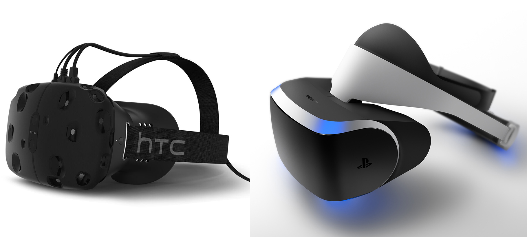
Sony PlayStation VR v HTC Vive review : Which VR headset is worth the wait?

It’s not all about Oculus

Oculus Rift is VR’s lucky charm, the headset that the whole industry is counting on. But you have two more options : Playstation VR and HTC Vive.

Both Sony and HTC’s headsets are set to go on sale in 2016 and offer different games and controls to the Rift. We’ve already put both head to head with Oculus’ headset in ourOculus Rift vs HTC Vive and Oculus Rift vs PlayStation VRbut, for good measure, lets see how Sony’s futuristic looking PS4 accessory stacks up to HTC and Valve’s PC-based virtual reality hardware.

Sony PlayStation VR v HTC Vive: Design

Sony’s PlayStation VR headset has a bit of futuristic flair to its design and is much more likely to elicit gasps of envy from your mates when they come round to check out your new virtual reality wares. It’s not all cosmetic though – Sony has stuck some of the device’s tech in a helmet-style section above the actual goggles.

This helps to distribute the weight relatively evenly around your head and not all on your poor nose and cheeks, something HTC’s Vive has suffered from. It’s not something that is an issue when you first slide a headset on but for 15 minute+ sessions, comfort is crucial.

As for the matte black plastic Vive, the lighter, more comfortable second-gen Vive Pre is less of a bulky black box than it looks. Both the PlayStation VR and Vive can be used if you wear glasses, both require separate headphones and Sony’s headset has a quick release button to make it quick to get it on and off.

HTC Vive v Sony PlayStation VR: Display

The current PlayStation VR specs stand at one 5.7-inch 1920 x 1080 OLED display inside the headset. It features RGB subpixels and is split to deliver a 960 x 1080 picture to each eye. The Vive offers a slightly higher resolution with two 1080 x 1200 displays (so slightly more pixels per eye) and a taller 9:5 screen ratio.

The Vive also has a slightly wider viewing angle of 110 degrees horizontally to the PlayStation VR’s 100 degrees. Still as ever with tech specs, it’s swings and roundabouts here.

Sony’s 120Hz refresh rate on the 2015 prototype bests HTC’s 90Hz, and we haven’t heard anything from HTC to suggest they will increase this in the final consumer device. Even though early games won’t run at 120 FPS, Sony’s tweaks means everything should look smooth and in theory, help to reduce motion sickness.

One final note: the latest prototype of the PlayStation VR has a small gap at the bottom of the headset. Whether you’re into that depends on whether you find being able to see your body/feet reassuring. The Vive achieves this quick glance at your real surroundings via a front facing camera and its chaperone feature.

We are not going to make any comparisons on picture quality based on a handful of demos on each headset – we’ll save that for our full reviews later this year.

Sony PlayStation VR v HTC Vive: Hardware

The PlayStation VR is a PS4 accessory and will come bundled with a second box which connects to your console via HDMI and USB. The stereoscopic 3D games are handled by the PS4’s AMD graphics processor not the headset. The headgear itself is wired for now but Sony hasn’t ruled out a wireless version of the device.

On the other hand, the Vive is a PC based headset so factor that into your costs when considering which to buy. HTC has not talked minimum specs for PCs yet so look out for this ahead of the Vive going up for pre-order.

HTC Vive v Sony PlayStation VR: Controls

Sony’s PlayStation Camera tracks the nine (very cool looking) LED sensors around the headset (up from six originally) 1,000 times a second and the set up can track the back of your head, not just the front.

That means you can look behind you in a VR environment. PlayStation VR also has its own 3D spatial sound engine, no surprise given Sony’s expertise in this area, so expect to see high profile games taking advantage of this.

As for controls, some seated games use DualShock 4 controllers which are spatially aware so for instance you can hack at an object in one ‘hand’ with a sword in the other. Other titles can be played with PlayStation Move paddles though Sony hasn’t given these as much attention as we’ve seen from Oculus and HTC on the controller options with those headsets.

The Vive setup uses Valve’s Lighthouse tech to track your head and hand movements around a 15 x 15 foot space via two basestations that are placed in corners of the room. The Vive headset and two new wireless controllers have 70 sensors between them and there’s more scope to play while standing up and moving around, if you have enough space in your house/flat.

HTC hasn’t put as much of an emphasis on spatial sound as Oculus and Sony but the final Vive headset is said to support 3D, directional sound so the option for devs is there to use it.

Sony PlayStation VR v HTC Vive: Games

Sony comfortably wins this round. Its slate of both original and reworked VR titles is genuinely exciting and the full list got a boost with a bunch of new PS4 titles in December.

There’s big names like Sony exclusive Gran Turismo, CCP Games’ space shooter EVE: Valkyrie, Crytek’s Robinson: The Journey and Ubisoft’s Eagle Flight demo as well as remakes and spin offs including Rez Infinite and Psychonauts in the Rhombus of Ruin.

Essentially, it’s a tantalising line-up and there’s something for everyone from Final Fantasy to 100ft Robot Golf as well as the stuff Sony’s own Studio is producing like London Heist. We just don’t know what will be ready for launch (apart from for example, Valkyrie) or if not, how long we will be waiting.

On the HTC Vive side, we’re looking forward to Valve’s Steam VR Developer content showcase on 28 January which should clear up a few questions about full games releases and maybe those Lionsgate and HBO deals too.

For now, we have a small selection of very impressive Vive demos, many of which make use of the room scale tracking from The Room to Job Simulator and Elite: Dangerous. There’s a good mix of traditional shooters and more family friendly fare but at this stage, we just need more to go on. Valve itself hasn’t made a game for Vive so Valve fans have only the Aperture Science and Secret Shop demos to satisfy them.

HTC Vive v Sony PlayStation VR: Price and release date

The HTC Vive preorders went up on 29 February with the headset shipping out on 5 April. The headset costs $799 which is a good $200 more expensive than an Oculus Rift but it does include two controllers, the Lighthouse base stations, some ear buds plus copies of the games Job Simulator: The 2050 Archives and Fantastic Contraption.

Here’s where things get less certain. Sony is still keeping quiet about both the price and release date of the PlayStation VR which leads us to believe we will be waiting until at least April to see it on shelves.

As this is a PS4 accessory and Sony has a stake in the games side of the business too, we’d be surprised to see a price higher than the $600 Oculus is asking for the Rift bundle.

Sony PlayStation VR v HTC Vive: Initial verdict

Your PlayStation VR versus Vive decision will largely depend on whether you have a PS4, a PC and – in the case of both – which one you want to use to game in VR. In the less likely scenario that you are willing to spend a lot of money on the whole system, here’s some very early thoughts based on multiple demos. We will update this feature when each of the in-depths reviews is in.

Both Vive and, of course, Oculus are worth a look if you think you have the system to run these games and HTC and Valve are working with their own developers to get the most out of room scale tracking.

But if you want the best selection of games then unless Valve really surprises us with its late January games showcase, Sony will have both well known and new PS4 titles to play when the PlayStation VR launches. Now, we wait.

(wareable.com)

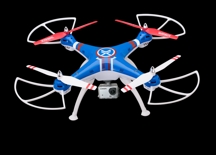
Swann Xtreem Gravity Pursuit Video Drone Review

Many people love the idea of a video drone: After all, who wouldn’t want to record the view from the air? But they aren’t cheap: A drone like the DJI Phantom 3 can set you back $700 or more. Answering the call of the budget conscious, the Swann Xtreem Gravity Pursuit shoots HD video for $250. But although it’s a fun drone to fly, it’s a compromise: You’ll have to go without GPS, automated flight, a video preview and other fancy features, such as autonomous flight.

Read full post here:
https://www.laptopmag.com/reviews/accessories/lenovo-thinkpad-stack

Lenovo Thinkpad Stack Review

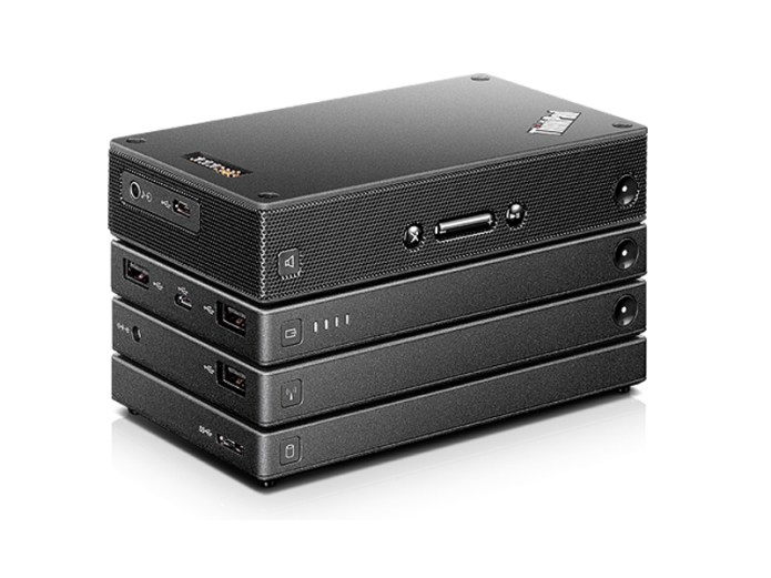
Traveling for business can mean carrying a lot of heavy gear, but it doesn’t have to be that way. Lenovo’s ThinkPad Stack is comprised of four modular accessories — a wireless router, an external hard drive, a battery pack and a Bluetooth speaker — that magnetically attach to each other, sharing power and data while taking up minimal space on your desk. Though each of the individual pieces works well enough on its own, their premium prices are only justified if you intend to use them together.

Read full post here:
https://www.laptopmag.com/reviews/accessories/lenovo-thinkpad-stack

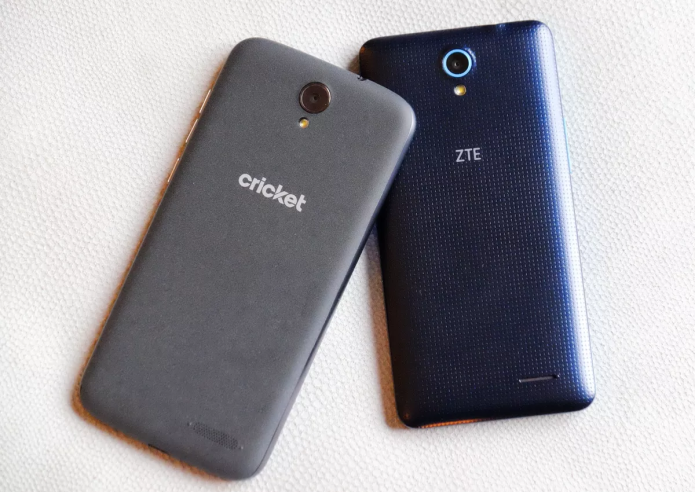
ZTE Grand X3 (Cricket Wireless) Review : Cheap But Sluggish

These days, you can get a pretty solid Android phone for around $200. ZTE’s Grand X3 on Cricket Wireless costs an even lower $129 yet offers a big 5.5-inch display, excellent battery life and a convenient USB Type-C port wrapped up in a premium body. However, the phone’s slow performance will annoy impatient users, and Cricket offers a better phone for the same price.

Design: Basic and Sturdy

The Grand X3 doesn’t feel like a $129 phone. The rounded rectangular slab is solid and sturdy, and reminiscent of the Alcatel Onetouch Idol 3. I love the soft touch finish on the Grand X3’s back and the glossy sheen up front.

Read full post here:
https://www.tomsguide.com/us/zte-grand-x3-cricket-wireless,review-3444.html

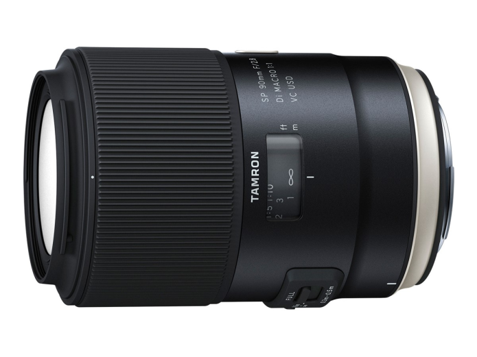
Tamron SP 90mm F/2.8 VC USD MACRO 1:1 VC Lens Video Reviews

First hands-on videos and reviews of the Tamron SP 90mm F/2.8 VC USD MACRO 1:1 VClens now available online.

Canada based photographer Dustin Abbott posted new video review for the new Tamron SP 90mm f/2.8 Di Macro 1:1 VC USD lens and its 15 minutes. On the other hand Matt Granger had a chance to see the Tamron’s new macro lens at the CP+ 2016 show.

Read full post here:
https://www.dailycameranews.com/

Apple iPad Air 3: What’s the story so far?

Apple offers three iPad ranges comprising the Mini, Air, and Pro, with five iPads available in total – the iPad Mini 2, iPad Mini 4, iPad Air, iPad Air 2, and iPad Pro.The iPad Air 2, which was unveiled in late 2014 alongside the iPad Mini 3, is well overdue for an update. Apple typically updates its devices annually, but for whatever reason, no new iPad Air was launched in 2015.

Although the iPad Air 2 is the same height and screen size as its predecessor,the iPad Air, it’s thinner and faster and features Touch ID. It is thought the new 9.7-inch iPad, which we are calling the iPad Air 3 for the sake of this feature, will be faster than its predecessor when it launches, but that’s just speculation for now and there is plenty more where that came from.

Read full post here:
https://www.pocket-lint.com/

2018 Porsche 911 GT2 RS Review

The Porsche 911 has stood as the ultimate sports car for more than 50 years, but the latest 991 body style is proof that Porsche still has plenty of tricks up its sleeve. With the refreshed 991.2 having already debuted in late 2015, the automotive world is now one step closer to the return of the extreme 911: the GT2 RS.

As is usually the case with any factory-built, race-ready sports car, the Porsche 911 GT2 RS made strong impressions when it was introduced in 2011, and as we’ve seen from the current 991 lineup, this is definitely the best 911 ever built. What this means for the upcoming GT2 RS has yet to be seen, but reports indicate that the hyper 911 will go on sale for the 2018 model year.

Read full post here:
https://www.topspeed.com/

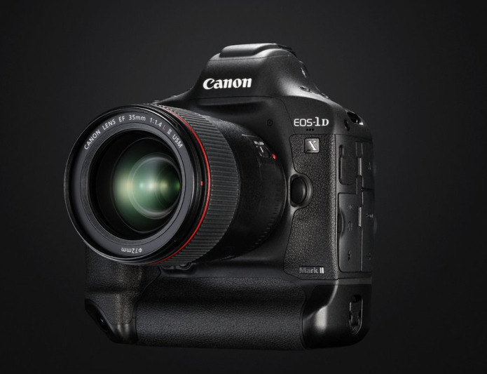
Canon 1D X Mark II Hands-on Video Reviews

First hands-on video reviews of the Canon EOS-1D X Mark II flagship DSLR camera now available online from several Youtube channels.

Park Cameras on Youtube posted a new video review featuring professional wildlife photographer Andy Rouse going hands on with the Canon EOS-1D X Mark II.

The Canon EOS-1D X Mark II ($5,999.99 – Amazon | B&H | Adorama) features a new 20.2 MP full frame CMOS sensor and new Al Servo AF III+, improved 61-point AF system with 41 cross-type AF points, new 360k RGB+IR metering sensor, Dual “DIGIC 6+” processors, 4K video capture up to 60p and an ISO range of 100 to 51200 (expandable from 50 up to 409600).

Read full post here:
https://www.dailycameranews.com/

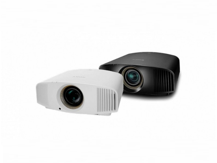
Sony VPL-VW520ES review

We know what you’re thinking: what does a projector have to do to justify a near-£9k price tag? You could buy a brand new car for that. Well, Sony has done some second-guessing and, as a result, given its top-tiering VPL-VW520ES everything you might (realistically) want from a 2016 projector.

That means it’s native 4K (of course!) like its predecessor, the VPL-VW500ES, and the five-star VPL-VW300ES we saw last summer. Sony’s proprietary SXRD system, which uniquely uses LCoS (Liquid Crystal on Silicon) technology – almost a cross between the usual DLP and LCD technologies – is still the only one currently offering native 4K playback, with rivals JVC and Epson only venturing as far as ‘faux-K’ projection.

Read full post here:
https://www.whathifi.com/sony/vpl-vw520es/review

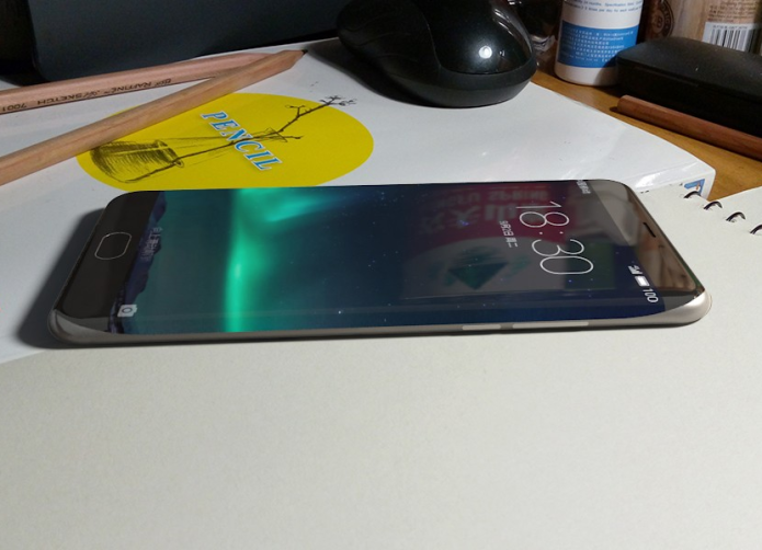
Meizu Pro 6 : a new flagship with a curved screen

Not long ago, we posted some information of the next Meizu flagship said to be called Meizu Pro 6. Now, there is more news related to this beast that you need to know. Probably the phone will be an edge version like…

Flagship Meizu Pro 6 to pack Galaxy S7 edge’s display tech?

As we know, Meizu is one of the best smartphone manufacturers in China. They produced great models such as Meizu M2 Note, Meizu Pro 5 and Meizu MX5 last year. Though, the company seems like not rushing in introducing new handsets at all because it has been more than 2 months since the start of 2016 and Meizu did not debut anything. Perhaps, they are carefully preparing beasts to compete with others like Samsung Galaxy S7, LG G5 and Xiaomi Mi5.

Read full post here:
https://www.pricepony.com.ph/blog/meizu-pro-6-a-new-flagship-with-a-curved-screen/

HP ZBook Studio G3 Review

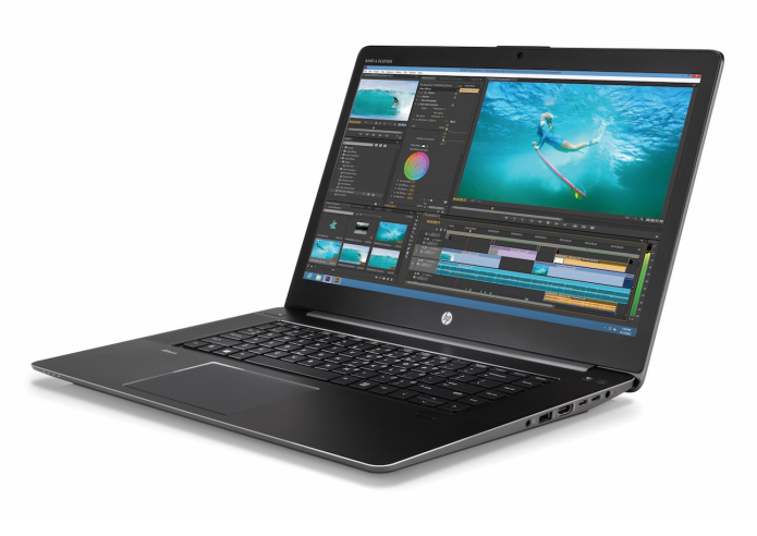
If you’re looking for a laptop with the processing power necessary to animate like Pixar or design like Jony Ive, you don’t have to settle for a workstation that looks like a workstation. The stylish HP ZBook Studio G3 (starting at $1,999; tested at $3,039) is light enough that it won’t hurt your back, and it’s armed with an Intel Xeon processor and Nvidia Quadro graphics that provide blazing-fast performance. This 15.6-inch, 4.6-pound notebook provides plenty of power and portability for the most-demanding users, but we wish its display were brighter.

Read full post here:
https://www.laptopmag.com/

Asus Z2 Poseidon VS Symetium smartphone: 6GB RAM flagship battle

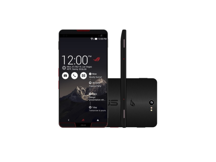
Besides the newly-launched Vivo Xplay 5 Elite with 6GB RAM, there are other 2 smartphones with the same enormous RAM. And today, we would love to put them under a comparison: Asus Z2 Poseidon VS Symetium

Asus Z2 Poseidon VS Symetium: powerful 6GB RAM

Symetium smartphone is a super fancy smartphone project that can be turned into a PC when connected to an HDMI screen via its USB Type C port. That also explains why the phone is equipped with 6GB RAM, so that it can work like any other decent laptop and computer we know today. Other than being turned to a PC, the device functions like a perfect smartphone with 5 inch FHD display with OLED technology, Snapdragon 820 chip set, and a huge 4,000 mAH battery.

Read full post here:
https://www.pricepony.com.ph/

Blu Pure XL Review

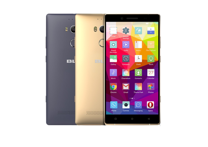
 Smartphones with astonishing spec sheets gain plenty of attention. The bigger the numbers, the more excited we get about the device in question. The trouble is, we know that getting all hot and bothered this way is foolish. Nothing’s every as good as it sounds on paper, but we ignore the rule and still do it. The Blu Pure XL has a spec sheet that’s drool-worthy, so we were very keen to give it a workout. Would it prove or dispel the rule?

Read full post here:
https://www.digitaltrends.com/cell-phone-reviews/blu-pure-xl-review/

2016 GMC Canyon Diesel Review

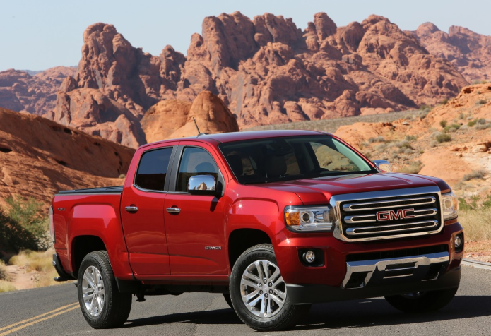
There’s nothing more powerful than an idea whose time has finally come, and in the world of light pickups that particularly prescient thought-form has manifested as turbodiesel power. After decades of denying diesel to anyone outside the heavy-duty truck world, both American and Japanese brands are starting to offer turbodiesel engines across a much wider range of pickup choices.

The 2016 GMC Canyon Diesel (and its Chevrolet Colorado Diesel twin) is perhaps the most aggressive and intriguing example of this new drivetrain philosophy on the market. There was little risk when Ram introduced its EcoDiesel full-size pickup just a few short years ago, as pent-up demand among half-ton customers was palpable (and borne out by the fact that Fiat-Chrysler can’t churn out enough diesel engines to meet demand). The GMC Canyon Diesel is a different story, however, since it’s the first, and only, mid-size truck to add a non-gasoline option to the order sheet.

Read full post here:
https://www.slashgear.com/

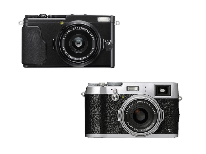
Fujifilm X70 vs X100T Comparison Table

Here is a quick comparison for the Fujifilm X70 vs X100T fixed-lens digital cameras with APS-c sized image sensors.

The Fujifilm X70 is the smallest and lightest X-Series digital compact camera features a FUJINON 18.5mm F2.8 lens, 16.3-megapixel APS-C sized X-Trans CMOS II sensor, EXR Processor II image processing engine, and a 180-degree tilting touchscreen LCD.

Read full post here:
https://www.dailycameranews.com/2016/03/fujifilm-x70-vs-x100t-comparison-table/

Dell Inspiron 15 3000 (2016) Review

The Pros

Affordable price; Powerful audio; Solid build quality

The Cons

Poor performance; Dim display; Shallow keyboard; Underside heats up

Verdict

Booming speakers and an affordable price tag can’t save this low performing laptop.

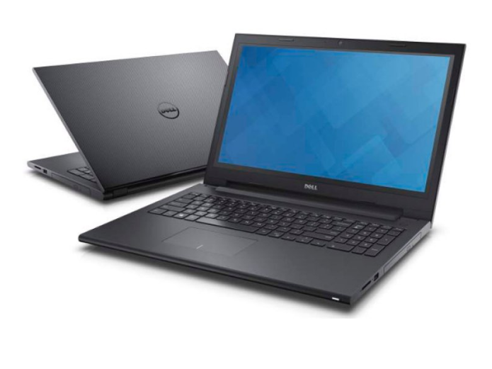
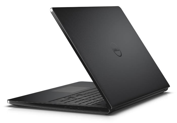
These days, there are solid laptops available for under $400. Unfortunately, the Dell Inspiron 15 3000 ($250 as tested) is not one of them. It may be one of the most affordable 15-inch notebooks available, but in our tests, the Intel Celeron-powered Inspiron struggled to perform everyday tasks like surfing the Web or watching online videos. Add in a set of shallow keys, a dim display and a burning hot bottom, and the Inspiron 15 3000 doesn’t seem like much of a bargain.

Design

The Dell Inspiron 15 3000’s black plastic chassis looks cheap, with its nail-file texture lid and glossy sides, but it felt well-made in my hands. This is one of the rare consumer laptops with a removable battery, a feature we don’t see often enough.

Dell Inspiron 15 3000 Design

Measuring 14.9 x 10.24 x 0.85 inches, the Dell Inspiron 15 has a similar size as other budget 15-inch notebooks. The Inspiron 15 weighs 5 pounds, which is heavier than the Asus F555LA (4.6 pounds) and the 14-inch Acer Aspire One Cloudbook (3.53 pounds).

Keyboard and touchpad

The Inspiron 15 3000’s keys feel stiff and have a shallow 1.19 millimeters of travel (1.5 to 2mm is typical). They require an acceptable 57 grams of force to actuate, but I still “bottomed out,” painfully hitting the base with a lot of force as I was typing.

Dell Inspiron 15 3000 quote

Dell Inspiron 15 3000 Keyboard

On the 10FastFingers.com typing test, I click-clacked my way to 74 words per minute with 99 percent accuracy, which is below my average of 80 wpm.

The notebook’s 4.1 x 2.4-inch touchpad has a solid feel to each click, and it accurately tracked my fingers. It correctly registered my three-finger swipes, but scrolling wasn’t as smooth as I’d like on Web pages.

Display

When I watched a Ghostbusters trailer on the Inspiron 15’s 1366 x 768 display, I was disappointed by its dull, lifeless output. Details such as Kate McKinnon’s steer skull necklace and the grips of her guns didn’t look clear. Green slime appeared too white, the red in the Ghostbusters logo did not pop, and Kristin Wiig’s cheeks were so pale, you’d have thought she’d seen a ghost. She had not.

Dell Inspiron 15 3000 Design

According to our colorimeter, the Inspiron 15 3000 can produce 73.2 percent of the sRGB color spectrum. That’s greater than the Asus F555LA (70.4 percent) and the Aspire One (53 percent).

We do not expect to find accurate colors from a $250 notebook’s display, so the Inspiron 15’s 3.9 Delta-E score for accuracy (where closer to zero is best) didn’t surprise us. The Aspire One (3.8) is better and the Asus F555LA (6.34) fared worse.

The Inspiron 15’s screen emits a low 145 nits of brightness. The Aspire One (244 nits) and the Asus F555LA (198 nits) are both much more luminous. This notebook’s dim screen is one of the contributing factors to its limited viewing angles, as I saw colors distort at 35 degrees to the left or right.

Audio

The Inspiron 15 filled a medium-size conference room with the sturdy bass drums, sweet high-pitched synths and crisp guitar chords of Charli XCX’s “London Queen.”

Dell Inspiron 15 3000 quote

The Dell Audio utility provides presets for sound enhancement, including Gaming, Movies, Music and Voice. We found the best overall sound with the default MaxxSense preset.

Performance

Our Inspiron 15 3000 drew poor performance from its Celeron N3050 processor, 4GB of RAM and 500GB 5,400rpm hard drive. I saw stuttering while scrolling in Chrome with only two tabs open, and the notebook did not stream 1080p video smoothly. That stuttering video performance may be connected to its single-band 802.11 b/g/n wireless modem, something of a relic when so many consumer laptops have dual-band 802.11 ac cards. Chrome slowed even further with six tabs open, pausing as I moved between already loaded pages.

The notebook did poorly in the Geekbench 3 general performance test, notching a score of 1,568. That’s predictably worse than the Core i3-powered Asus F555LA (2,080) and close to the Celeron-powered Acer Aspire (1,646).

The Inspiron 15’s file-transfer performance is also low, as its 5,400 rpm drive copied 4.97 GB of files in 3 minutes and 16 seconds, for a speed of 25.7 MBps. That’s slower than the 5,400 rpm hard drive in the Asus F555LA (32.2 MBps), and the eMMC storage in the Aspire One (48 MBps).

Dell’s laptop took its time in the OpenOffice macro test, needing 15 minutes and 3 seconds to match 20,000 names and addresses. The Aspire One (15:08) also took a long time, but the Asus F555LA (6:31) finished in less than half the time.

Ports and Webcam

Dell placed a USB 3.0 port, an HDMI port and an SD memory reader on the left side of the Inspiron 15. The notebook’s two USB 2.0 ports, DVD-RW drive, headphone jack and Kensington lock slot sit on its right side.

Dell Inspiron 15 3000 Ports

The notebook’s 0.9-megapixel webcam captured noisy but accurate selfies that did a good job reproducing the color of my purple shirt and the red Purch wall.

Battery Life

The Inspiron 15 3000 lasted 5 hours and 33 minutes on the Laptop Mag Battery Test, which involves continuous Web surfing at 100 nits. That’s far less than the Aspire One (14:43) but near the Asus F555LA (5:44) and the mainstream laptop category average (5:57).

Graphics

The Inspiron 15’s integrated Intel HD graphics processor only ran casual games like Asphalt 8 and the pre-installed Candy Crush Soda Saga. The notebook scored 18,154 in the 3DMark Ice Storm Unlimited gaming benchmark, which is near the Aspire One (18,065) and lower than the category average (72,103) as well as the integrated graphics-powered Asus F555LA (46,285).

Heat

The Inspiron 15 stays cool up top, but gets hot down below. After the laptop streamed 15 minutes of full-screen HD video, our heat gun registered acceptable temperatures on its touchpad (86 degrees Fahrenheit) and keyboard (87 degrees). However, its underside (107 degrees) broke our 95-degree comfort threshold.

Software and Warranty

Dell’s given the Inspiron 15 3000 a fairly clean installation of Windows 10. SupportAssist combines a system-scan utility with information about your laptop that customer service will need in the case of a call, and Power Manager Lite offers Advanced Charge settings it says will prolong the battery’s usable lifetime. CyberLink Media Suite Essentials offers media playback and video-editing tools.

The Inspiron 15 3000 comes with Dell’s standard 1-year limited warranty, with mail-in service following remote diagnosis.

Configurations

We tested the entry-level Inspiron 15 3000, which has a Celeron processor, 4GB of RAM, a 500GB 5,400 hard drive and costs $250. For $380, you can get the Inspiron 15 with a Pentium processor, 4GB of RAM and a 128GB SSD. The high-end version of this notebook costs $450 and has a 5th-Generation Core i3 processor, 6GB of RAM, a 1TB 5,400 rpm hard drive and a 1366 x 768 touch screen. Configuring the laptop with at least a Pentium CPU would probably make a dramatic difference in the performance.

Bottom Line

A great example of “you get what you pay for,” the Inspiron 15 3000’s slow performance, hot temperatures and dull screen make it a poor deal, even at $250. For even less money, the 14-inch Acer Aspire One Cloudbook lasts nearly three times as long on a charge.

Dell Inspiron 15 3000 Lid

However, if you can afford to spend just a little more, the Asus F555LA ($370) offers better performance, a sharp 1080p display and speakers just as strong as the Inspiron’s. You may get acceptable performance if you configure the Inspiron 15 3000 with a better processor, but for a higher price, you can get a better laptop overall.

(laptopmag.com)
SEA-DOO 1630 : ACE Sea-Doo’s 1630 ACE packs 300 horspower and is the company’s most powerful engine yet.

This 300 hp PWC engine earns respect.

Though Sea-Doo has perennially been a frontline combatant in the personal-watercraft horsepower war, recent years have seen the manufacturer focus on ergonomics and handling. For 2016 the emphasis shifts back to power, with the introduction of the 300 hp Rotax 1630 ACE, the most powerful engine the brand’s Austrian power-plant manufacturer has ever produced.

Read full post here:
https://www.boatingmag.com/sea-doo-1630-ace/

Garmin fenix 3 Sapphire Review

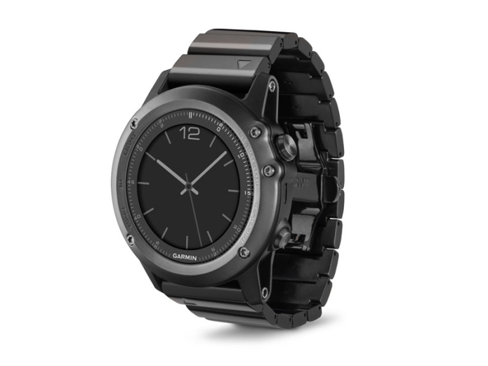
When you’re in the great outdoors, it helps to know where you’re going and where you’ve come from. The Garmin fenix 3 Sapphire GPS watch not only tracks a wide range of activities — from skiing to canoeing to hiking — but also has excellent battery life as well as a bevy of sensors that tell you your altitude, the temperature and even if the weather’s about to turn for the worse. At $599, the fenix 3 Sapphire isn’t cheap, but if you need a dependable watch when you’re communing with Mother Nature, this is the one to get.

Read full post here:
https://www.tomsguide.com/us/garmin-fenix-3-sapphire,review-3437.html

Avegant Glyph review: A wearable cinema for serious movie fans

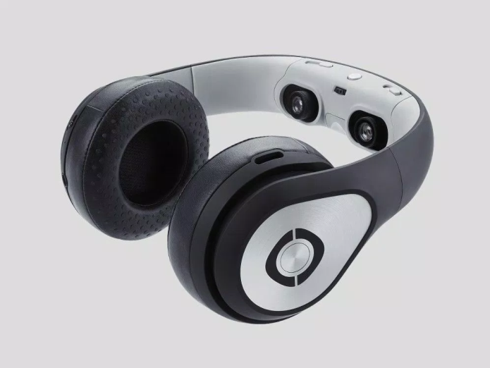
The idea behind the Avegant Glyph is pretty simple. It’s a $699 portable, wearable movie theater. And if you’re thinking it looks more like a pair of Beats than a cinema screen, there’s good reason: It moonlights as a pair of regular headphones, of course, though video viewing is why you’d want to buy one. Inside the headband are two eye holes, behind which is some clever micromirror projection technology that beams 720p video directly into your eyes. Wear the Glyph like a VR headset, and plug in an HDMI source and you’re good to go. If all this sounds familiar, it’s because the Glyph has been in development for a few years now. This right here, however, is the version that’s about to ship. I’ve spent some time with my head in one, and it’s pretty neat. And, yes, a little weird.

Read full post here:
https://www.engadget.com/2016-03-01-avegant-glyph-review.html

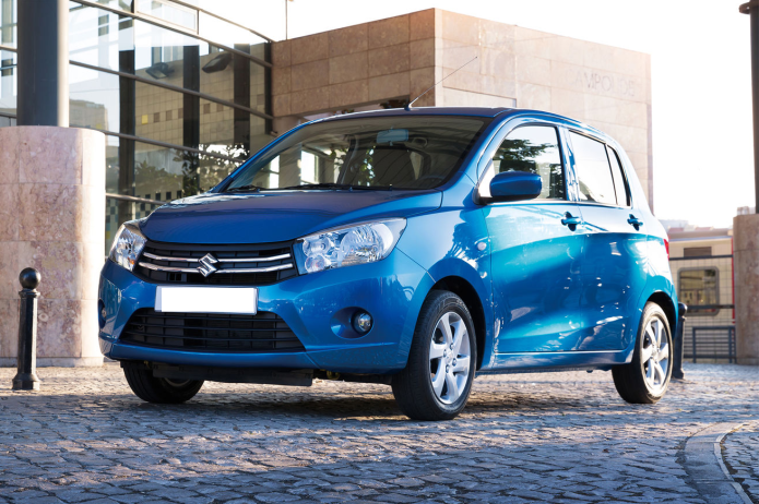
Suzuki Celerio Review : Roomy budget city car is cheap to run

The Suzuki Celerio is a five-door supermini with two big selling points: it’s bigger than city cars such as the Volkswagen Up andSkoda Citigo, but smaller than traditional superminis such as theFord Fiesta – thus making the Celerio roomy, yet still easy to fit into tiny of parking spaces.

And then there’s the price. The Celerio is one of the cheapest new cars you can buy, and the entry-level SZ2 model costs just £6,999/$10,500, although by buying one through carwow you can save an average of £530/$795.

Read full post here:
https://www.carwow.co.uk/

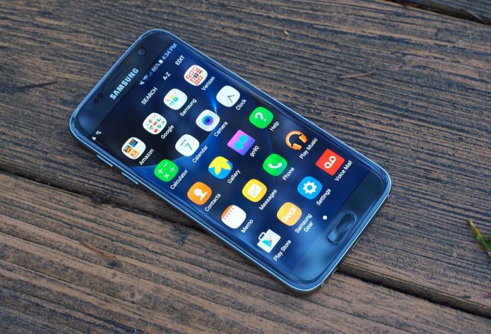
Samsung Galaxy S7 Review: Beauty and a Beast

Last year’s Galaxy S6 pioneered a bold new design for Samsung’s flagship phones, with its luxurious glass-and-metal design, best-in-class display, blazing performance and top-notch camera. But to get there, Samsung had to sacrifice beloved features, such as microSD expansion and water resistance, that had been key components of its previous (though plasticky) flagship, the Galaxy S5. On the S7, Samsung has combined the best features of its previous two Galaxy S phones while simultaneously upping the ante for other phone makers. A slicker, more thoughtful design; a jaw-droppingly quick camera; a powerful Qualcomm 820 processor; and the latest version of Android result in a handset that’s both a beauty and a beast.
Read full post here:
https://www.tomsguide.com/us/galaxy-s7-s7-edge,review-3403.html

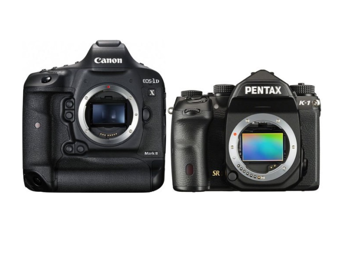
Canon 1DX Mark II vs Pentax K-1 Specifications Comparison

Here is a quick review and comparison for the Canon 1DX Mark II vs Pentax K-1 DSLR cameras with full-frame image sensors.

To see the difference between Canon 1DX Mark II vs Pentax K-1 cameras we have put together Canon 1DX Mark II vs Pentax K-1 specs comparison table below.

Read full post here:
https://www.dailycameranews.com/

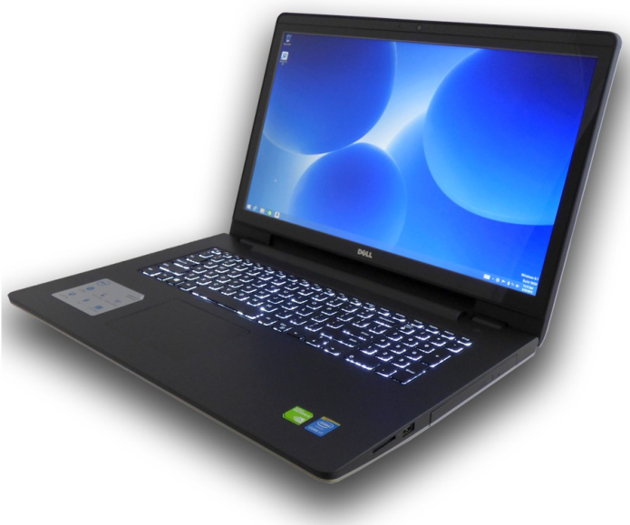
Dell Inspiron 17 5000 Review

If you’re looking for a laptop for productivity and entertainment, there’s nothing like a big 17-inch screen to immerse yourself in for work and play. The Dell Inspiron 17 5000 gives you that, plus solid performance for an affordable price (starting at $449, $499 as tested). We’d prefer longer battery life and a keyboard with more travel, but overall, this laptop is a good value.

Read full post here:
https://www.laptopmag.com/reviews/laptops/dell-inspiron-17-5000

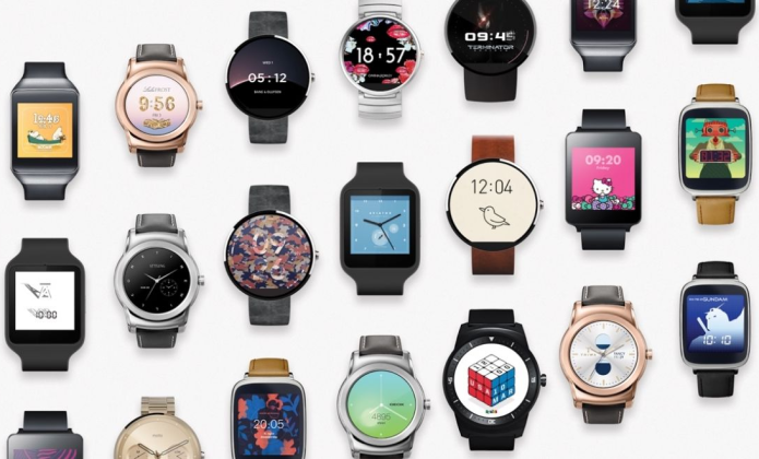
Best apps for Android Wear: Download these top smartwatch apps now

With over 4,000 Android Wear apps available, there’s no excuse for settling for the default functionality that comes built into your Android Wear smartwatch. You need to take advantage of some of the best new apps for your smartwatch and really make the most of your intelligent wearable.


A good Android Wear app should give some serious added value to your newest gadget, take you away from your smartphone, and generally make your life a lot easier.

Still, some Wear apps that sound promising just don’t cut it once downloaded and the most popular apps on Google Play are actually watch faces. To save you time, we’ve rounded up our favourite apps to install straightaway…

Read full post here:
https://www.wareable.com/