Android has been making some big moves recently, redesigning and adding functionality to the mobile operating system to make it more capable and more competitive.
With the advent of Lollipop, Android moved to a state that felt like it was complete. It had polish that rivalled manufacturer skins, a maturity to apps that made them wonderful to use.
That was cemented with refinement in Marshmallow that saw many manufacturers moving to accommodate Android’s native charms, rather than stomp all over them.
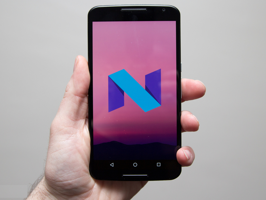
Anticipation is high for Android N and in an uncharacteristic move, Google has released a developer build of Android N into the wild much earlier than expected. We’ve been playing with the future version of Android see what’s changing, what’s new and what we can expect come launch day.
This is Android N and this is everything you need to know.

Android N release date and availability
Android N has been revealed much earlier than it has in the past, with a preview version of Android N made available by Google on 9 March.
In the past the first glimpse of the next version of Android has been at Google I/O. This is Google’s developer conference opening this year on 18 May 2016. We’re expecting to see a lot more of Android N at Google I/O but this time armed with some knowledge about what it can do.
Google has already said that the final preview version of Android N will be ready by the summer, so well in advance of previous years.
The final consumer version of Android N won’t land until later in the year however, usually around October. This is typically timed with the release of anew Nexus handset, making the debut of the new Android version, but perhaps the earlier preview suggests an earlier release of the next Nexus.
The roll-out of Android N to other devices usually then follows, hitting existingNexus hardware within a few weeks, but often taking several months to be incorporated into other devices. Want Android N on your Samsung Galaxy S7? You’ll probably be waiting until March 2017.

What will Android N be called?
Google names its Android versions after sweet treats. That’s run on for years, recently taking in Kit Kat, Lollipop and Marshmallow. So what will be the name of Android 7.0?
The naming of the next version of Android might come down to an online poll: Google SVP Sundar Pichai recently told students at Delhi University that it might be down to the fans to decide.
But Google is already having fun with the speculation: writing in a Medium post, Hiroshi Lockheimer, SVP Android at Google, pokes fun, saying: “So, the burning question that’s on everyone’s mind: what will the N release be named? We’re nut tellin’ you yet.” You can expect a lot more of this sort of stuff until the final reveal and unveiling of a new lawn figure at Google HQ.
Android Beta Program
One of the important differences in the early days of Android N compared to previous versions is that it’s incredibly easy to get. Google has opened up a the Android Beat Program that means you can simply enrol a device and have the update delivered over the air.
In previous versions you’ve been invited to download the software and manually flash it to your device. The big difference this makes is that Android Nis much more accessible and you can load it onto a Nexus or Pixel device without losing all the content.
Regular updates are expected to follow, in the same fashion as Microsoft ran the Windows Insider Program. If you’ve got a supported handset that’s spare, you can take a look at what’s to come. We’ve written all about getting involved in the Windows Beta Program in a separate feature.
Android N preview
Thanks to the release of the Android N preview, we now have plenty of information about what Android N might look like when it lands on a consumer device later in the year.
One thing to bear in mind with beta previews is that they are subject to change. The whole point of these preview programmes is that developers can feedback information and Google can evaluate which features are ready to be released. Some of what we see here may change over time, may not make the final release, or could be a rock solid feature.
It’s also worth bearing in mind that Google often keeps something in reserve. There is likely to be big headline feature that’s left as a surprise for launch day.
We’re still exploring some of the things that the Android N preview offers, so we’re updating this feature as we get to the bottom of things. There are some things we’re not looking at here. Doze, for example, is reported to be much more enhanced, allowing apps to sleep whenever the display is in standby, not just when the device is inactive. There’s also picture-in-picture for Android TV coming.

Android N quick settings
The notifications pane and quick settings go hand-in-hand because they occupy that same space at the top of your display. Swiping down now reveals a pane that spans the entire width of your display, a slight change in the visual design from Lollipop and Marshmallow that followed the card theme.
Quick settings now occupies a smaller bar at the top, carrying the icons for those quick settings, but with no labels or anything else. You’re just expected to know what they mean and that’s fair enough – as these are quick settings, you’re likely to know what they’re there for. What’s different is that a single swipe gives you a number of settings. On the Nexus 6 that’s five icons, with a drop down arrow to expand the quick settings area to the full pane. One omission is the shortcut to the full settings menu, which sits at the top of the page all the time in Marshmallow.
The full quick settings pane is similar to the current offering in Marshmallow, offering a brightness slider and nine icons, but here they flow over the page and offer up an edit function. This will let you drag options around so you can choose what you see where. It’s very simple and somewhat overdue.
There are no drop down options on things like Wi-Fi or Bluetooth here, but with a tap you get a neat overlay menu – a little like the do not disturb pane in Marshmallow. Tap the battery, for example, and an overlay pops up with a graph and your estimated time left. Tap Bluetooth and it will show paired devices that are available. In both cases, a long press will take you through to those sections in the settings menu. This means more options for less space and a cleaner UI, which we’re all for.
There’s a neat animation that sees the top quick settings you get on the first swipe shifting location to reveal the full set.

Android N settings menu
The settings menu has had a makeover, removing some of the division bars and bubbling up more information. When you open up the settings menu, you’re now faced with a bit more information. The new N arrangement makes Marshmallow look at little sparse, so this is a change we like.
One of the interesting elements is that there’s now a status banner at the top of the page, perhaps to let you know what’s going on if you’re heading in to the settings to change something. If you’re in data saving mode, that’s labelled here, as is do not disturb. If you were heading in to fix something like not getting updates or alerts, there’s now that quick option at the top to turn those major device behaviour features off.
There’s also a suggestions bar. If you don’t have security set-up on your device, it’s here that Android will suggest you do something about it. At the moment it’s difficult to know what the range of suggestions will be – but rather like theBlackBerry Priv with its suggestions from DTEK, perhaps this is Android looking to guide users a little more around things like security.
Otherwise the settings menu is laid out using the same sort of icons as it was before and in the same sort of arrangement. But as we said, there’s more information, so you don’t have to go digging. We can see at a glance that on this test device, there’s 74 apps installed, we’re using 7GB of storage, the battery will last for another day and so on. There’s no diving in and out of areas, because this information is all there at a glance.
However, there’s a new navigation option for settings. Once you’re in an area – like Bluetooth for example – you get a side menu. This will let you jump to any area of the settings quickly. We can’t really see that it’s that useful at the moment, as hitting back to return to the top level isn’t that tricky.

Android N notifications
Continuing this theme of bubbling up more information, the notifications are now richer than they were before, containing information on where they came from. If you have a number of notifications from one app, these can be bundled together much more cleanly than they were before.
They can still be pinch expanded, but there’s also long press options to control notification behaviour. Press and hold and you’ll get access to block or silence notifications, rather than having to dig into the application settings.
This can also be done from the lock screen, so if you’re getting notifications you don’t want, it looks as though it’s going to be easier to individually manage them.
The do not disturb system is still in place, but it looks like the language is changing as Google tries to refine a systems that’s very powerful, but has certainly been confusing through Lollipop and Marshmallow. There’s now the option to have an app’s notifications “override do not disturb” which is a little more direct than it might have been phrased in the past.
We’ve not seen the full range of notifications, but we can already see from a mass of Gmail notifications, that it’s going to be much easier to open the email you want and action it. There are also going to be direct reply notifications. This is something that Android has been talking about for some time, and Messenger sort of went there with a reply outside of the app, but this is now expanding. We’re yet to actually see it in action, however.
Notifications has always been a strong part of Android and it looks like N is no exception.

Android N goes into multi-tasking overdrive
This is where things get different and pretty exciting, as Android N looks fully equipped for multi-tasking mayhem. This is going to serve devices like the Pixel C really well, but there’s a lot for smartphone users too.
Marshmallow gave the home button a makeover with Now on Tap, but inAndroid N, the recent apps button gets a complete revamp.
In previous versions of Android the “recent apps” button has been a bit of a damp squib. Even Samsung hung onto a menu button for several generations, but here in Android N it has real purpose. All it really did was tap to open and tap to close the recent apps Rolodex.
A tap on the recent apps button brings up the card-style deck of your apps. But a repeated tap now cycles through apps. Rather than flicking with a finger, you can keep tapping the button to move through your apps. There’s a timer too, so if you pause, that’s the app you’ve selected. It works pretty well, and we can see multi-taskers frantically tapping through things.
Then there’s a double-tap option. This will quickly switch from your current app to the last. This will become a core feature, we can feel that in our bones. How many times have you been looking at an email and switching to maps or similar? We do it a lot.
We mentioned Samsung just now and that was no accident, because spilt-screen viewing is pretty similar to Samsung’s implementation. A long press on the recent apps button takes you into split-screen mode. Like Samsung it takes the current app to the top of the page and lets you select the bottom app. However here it lets you use that tapping action again to leaf through your recent apps and select the one you want to fill the bottom half of the screen.
You can tap the home button and select a new app, even opening up the apps tray. When you pick your app, you return to split-screen mode. The clue to where you are is the style of the button, changing from a square to two rectangles to represent that split display. One thing is for certain: those devices opting for capacitive buttons rather than on-screen buttons will easily get lost with this feature.
Some of it’s a bit rocky because this is an early dev build, but we can see this could be a hugely powerful feature.
Android N data saver
One of the other interesting new things is data saver. This isn’t unique toAndroid N, because there’s a function on the Samsung Galaxy S7 that does the same thing, for example.
It’s an important job however, and that’s restricting background data on apps when you’re on a mobile/cellular network. The idea is to save data on your plan, but when you’re connected to Wi-Fi, all your apps get there data access as normal.
It should have the added advantage of saving battery life too.
Android N battery level indication
One of the very simple but very annoying omissions from stock Android has been a simple indicator of the battery life. You only get a percentage when you flip down the quick settings pane, rather than all the time like you do on just about ever other Android skin.
In Marshmallow, Google included an option to turn on a battery level indicatorin the System Tuner UI. This is a hidden part of the menu designed for developers and it’s though that this might become standard in a future version of Android. In the Android N preview the System Tuner UI still has this option, it’s not a standard offering.
With other areas – like the settings menu – seeming to be looking to elevate more information, this would make perfect sense. Fingers crossed, it’s the simple things that matter.
Android N: App drawer or no app drawer?
Rumours have been circulating that app drawer’s days are numbered. That wasn’t helped when a tweet from the Google Maps Twitter account appeared showing a phone with no app drawer.

It’s a brief flash, but it shows a Nexus 6P with no apps drawer button in the centre, instead with three dots indicating different pages to scroll across to. Google quickly moved to say this was a misrepresentation and inaccurate, but fans were already throwing their toys out of the pram.
There’s been murmurings that this might happen for some time. For Android users it’s a key distinction between Android and iOS. iOS, as you’ll know, has spread its app wares all over the home screens since the dawn of time, whereas Android has always been more discreet.
But (and this is a big but), this only added fuel to a fire that was already burning. Android Authority reported previously that it had heard from two sources confirming that Google planned to ditch the app tray.

Removing the app drawer is common on Chinese devices – it’s a hallmark of Huawei’s EMUI for example – but we’ve now seen that move replicated by theLG G5. Additionally, hiding in the Samsung Galaxy S7’s settings is a section called Galaxy Labs, which also gives you the option of removing the apps tray.
We’d say that’s quite a body of (perhaps coincidental) evidence to suggest that something is afoot. Of course, this being Android, switching the launcher would likely right any wrongs.
(pocket-lint.com)