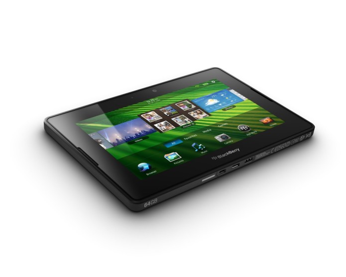
Until today, the consumer tablet market has been defined by the battle between iPad and Android. Apple’s best-selling slate has set expectations for mobile utility and usability, managing to persuade users that – despite years of Microsoft Tablet PC promotion – the company pretty much invented the tablet segment. Google’s Honeycomb (review) has launched its offensive against the iPad titan, and now it’s the turn of RIM and the BlackBerry PlayBook. Initially billed as the enterprise-focused slate a BlackBerry phone toting business person would covet, the PlayBook’s scope has gradually grown to encompass the consumer market too. Has that spreading focus left RIM with the jack of all trades or the master of none? Check out the full SlashGear review after the cut.
Hardware
A nondescript black slab measuring 7.6 x 5.1 x 0.4 inches and weighing 0.9lbs, the PlayBook is a combination of the very glossy and the pleasingly matte. The whole front is a slab of glass hiding a 1024 x 600 WSVGA LCD touchscreen, the touch-layer of which extends – Palm Pre style – off into the bezel around the panel itself. The sides and back are metal with a rubberized coating for easier grip. Ports and controls are minimal, which makes it all the more frustrating that the one button you’ll probably be spending the most time tapping, the power key, is such a frustration. Tiny, recessed and overly-sprung, it’s hard to find without looking and hard to press without jabbing the tip of your finger at just the right angle.
…
Read full post here:
https://www.slashgear.com/blackberry-playbook-review-19146913/


