Our Verdict
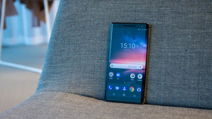
The Nokia 8 Sirocco is one of most well-crafted Android phones we have come across, but compromises under the hood and an underwhelming camera works against it, nevermind the steep asking price.
PROS
- Classy design
- Android One certification
- Day long battery life
CONS
- Aged hardware
- Underwhelming camera
Nokia 8 Sirocco: Detailed Review
Nokia’s resurgence has mostly relied on a portfolio of mid-range and entry-level smartphones. It makes sense. The Nokia brand in the past stood for affordability and ease of access. But it was also known for pushing the boundaries of product design and beautiful craftsmanship. While a majority of Nokia’s Pure Android portfolio consists of mid-range and budget devices that represents the affordable part of Nokia’s philosophy, the Nokia 8 Sirocco (along with the Nokia 8 last year) is a sign that HMD Global-backed Nokia also aims to establish itself as a premium brand. Yet, much has changed since Nokia made the unfortunate exit from the smartphone market. As of now, the premium flagship segment is dominated by a handful of players, all of which are established and well-known such as Samsung, Apple, OnePlus and the likes. In fact, even well-known brands like LG and HTC have been bleeding themselves dry trying to convince customers to buy their flagships instead of the tried and tested Galaxy and the iPhone. The Nokia 8 Sirocco is the company’s best-looking phone till date, but does it have enough to convince buyers to ditch the existing options and go for a brand that’s new as well as have a lasting legacy? We find out.
Design
As I mentioned earlier, the Nokia 8 Sirocco is the best looking Nokia phone to date. All of HMD Global’s smartphone portfolio has been designed keeping mid-range buyers in mind. Even then, most of the Nokia phones look distinctly different from the rest of the crop and the Nokia 8 Sirocco really stands out. Stunning design aside, this is also one of the most radically different devices in comparison to its peers. There’s no notch. There’s no taller 18:9 display. For the most part, it’s a reimagination of the Nokia 8 from last year with certain changes to the camera on the back and the materials used to make the phone. But then again, phones have never looked so good.
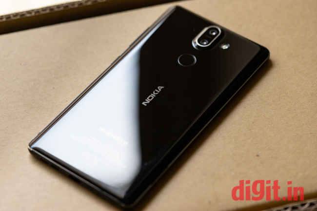
The phone is built out of a single block of stainless steel sandwiched between glass on both sides. The screen also curves to meet the glass panel at the back and there’s a shiny steel rim that runs around the edges. At its thinnest, the Nokia 8 Sirocco is just 2mm thin. Simply put, this is craftsmanship at its best. It does look a lot like the Blackberry Priv which also was quite radical for its time. Because of its traditional design, the Nokia 8 Sirocco comes off as short and stout. It’s too wide for one-handed use and too small for multi-tasking. The steel frame is also quite sharp and tends to dig into the palms during prolonged use. It does render some discomfort while using, but not something that drastically impacts the ergonomics.
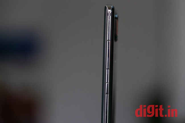
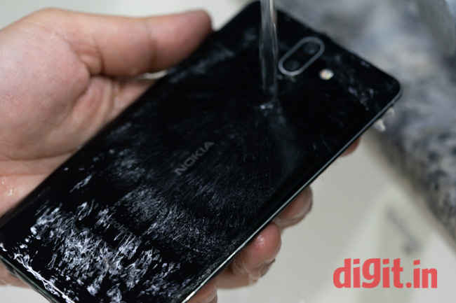
The Nokia 8 Sirocco looks a lot like a pebble. It’s shiny and has a shimmer thanks to the ceramic-like finish. However, that also makes the panel at the back a smudge magnet. Truth be told, slapping a case at the back of this phone should be a criminal offence. But the glass back does need the additional protection. There’s Gorilla Glass 5 both on the front and the back that promises durability, but history is not on its side. Nevertheless, even though it would be a disservice to put the Nokia 8 Sirocco in a case, it is necessary. In fact, the box comes with a TPU clear case that at least prevents smudges on the phone.
The added weight because of the stainless steel frame adds to the premium feel of the phone. The camera bump is also quite prominent and you can’t keep the phone flat on the surface. Because of the camera bump though, it’s easier to find the fingerprint sensor at the back which is quite responsive. The phone is also IP67 water and dust resistant and the glass panel at the back facilitates wireless charging.
The materials used, the finish, and the feel of the Nokia 8 Sirocco in the hands certainly makes it one of the best-designed phones out there, but the fact that it bucks the latest trends might not bode well with most users. Especially for the price and considering that it runs on hardware that’s a year old now, the Nokia 8 Sirocco is looking at stiff competition from this year’s flagships. Nevertheless, the premium feel is what HMD hopes will draw buyers to the phone.
Display
Compared to last year’s Nokia 8, the refreshed offering has even smaller bezels on the top and the bottom while the sides are essentially bezel-less. This means that the screen takes up most of, the real estate up front. The display has the traditional 16:9 aspect ratio and curves to meet the edges like the Galaxy S7 Edge and the Blackberry Priv. Being used to seeing the taller 18:9 display, the wider and smaller panel on the Nokia 8 Sirocco felt almost like going back in time. But thanks to the 5.5-inch screen size, the aspect ratio more or less works for the phone.
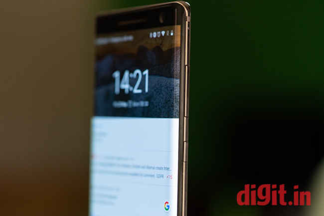
The panel type on the Nokia 8 Sirocco is P-OLED, like the Pixel 2 XL and has quad HD resolution. However, it has the same issues that plague the Pixel 2 XL. For instance, there’s a blue tint when you tilt the display slightly. It’s more evident when you’re viewing something on a white background, like Gmail. The curves also distort content at the edges. Viewing photos and videos tends to be problematic as the parts of the image or the video around the edges tapers from the sides. The curved edges also quite inept at palm rejection. The Galaxy S9, which has a similarly curved screen has algorithms to detect the palms coming in the way and blocks the input from the edges. That’s not there in the Nokia 8 Sirocco and I often had accidental touches because the palms touched the edges. All that is an indication that even though the curved edges look futuristic, the implementation needs more work. However, thanks to the extra pixels in the display, text and the interface, in general, look rich and vibrant. The peak brightness of the panel on the Nokia 8 Sirocco is quite high and I had no problem in using the phone outdoors. Since this is an AMOLED panel, the blacks are quite deep and colours tend to pop out. If not for the distortion around the edges, this would have been one of the best displays in the class of compact phones.
Performance
The Nokia 8 Sirocco may have received some superficial upgrades from last year’s Nokia 8, the underlying hardware is in some ways still the same, which means the performance of the phone is also expected to be on last year’s standards. The 8 Sirocco is powered by the Snapdragon 835 chipset coupled with 6GB of RAM and 128GB storage. There’s an added option to expand the storage via a microSD card as well. The fact this phone runs on older hardware might be an indication that Nokia plans to launch a full-fledged flagship later this year and the 8 Sirocco is indeed a special edition to showcase its craftsmanship.
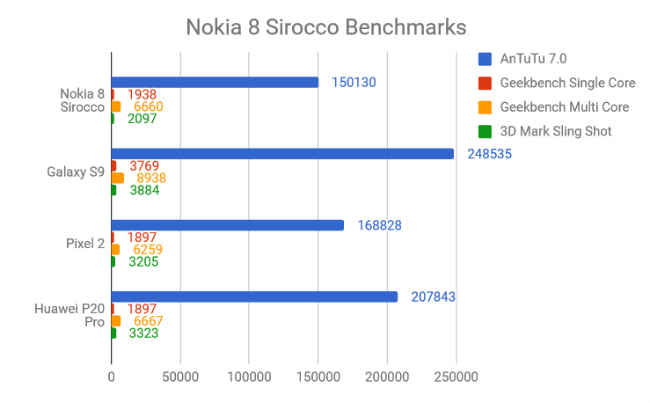
The older hardware expectedly performs poorer than other 2018 flagships on synthetic benchmarks. On AnTuTu 7.0, the Nokia 8 Sirocco notched up a score of 150130 which is definitely much lower than the Samsung Galaxy S9, which scores 248535. It also couldn’t beat the Pixel 2 XL. On Geekbench Single Core and Multi-Core tests, the Nokia 8 Sirocco scored 1938 and 6660 respectively, again in line with last year’s flagships.
In real world usage, the Nokia 8 Sirocco is quite a performer. All the apps I tested on the phone performed perfectly fine. Games like the PubG Mobile ran smoothly with no frame drops (although the smaller screen did take some time to get used to). I used the phone to type out an article and I particularly liked the typing experience. The haptic feedback is quite close to phones like the iPhone 8. Furthermore, the phone can also do some heavy lifting in the form of transferring around 15GB of files from an USB OTG pendrive to the internal storage qutie fast.This only goes on to show that synthetic benchmarks are only one half of a story.
This makes me wonder about the philosophy of the company. Last year’s lineup of Nokia phones weren’t really powerful either, as far as the spec-sheet was concerned, but they did perform as advertised — Snappy and reliable. The company, which is just a year old, might be optimising software and older hardware to deliver buttery-smooth performance. A part of that smooth performance could also be due to the fact that the company relies on pure, stock Android. In fact, the Nokia 8 Sirocco is Android One certified, and over my period of use, I already received the April 2018 security patch. Nokia has done good on its promise of pushing out regular updates. The older Nokia phones that came out with Android Nougat are all updated to the latest version of Android Oreo. Android One also promises two years of version upgrades which means the phone will not become outdated in just a year.
Camera
Cameras can be the defining point for a smartphone’s failure or success, and the ones at the back of the Nokia 8 Sirocco are just about average. They don’t do much to convince buyers to look beyond phones like the Pixel 2 or the Galaxy S9 which are a tad more expensive. The Nokia 8 Sirocco touts dual cameras by Zeiss optics, but the iconic lens maker doesn’t instil much confidence as the sensor on the Nokia 8 Sirocco is exactly the same as that of the Nokia 7 Plus. Now, the imaging prowess of the 7 Plus isn’t exactly bad for the price it’s offered at, but for double that price, one would definitely expect more from the 8 Sirocco. Nevertheless, there are dual sensors at the back. The primary 13-megapixel lens has a f/1.7 aperture while the other 12-megapixel sensor has a f/2.6 aperture and acts as the zoom lens. Things like OIS are lacking from the phone which was there on the Nokia 8 last year.
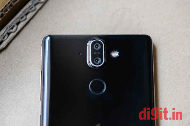
What’s new is that the 8 Sirocco now uses the Nokia Pro camera app which makes taking photos really easy. Everything is easy to access. A swipe up from the bottom brings up the pro mode where you can tweak the exposure, white balance and the likes, while on top you can toggle the bothie feature on or off or go live straight from the app. You also get 2X optical zoom on the phone.
Photos shot during the day in well-lit situations from the Nokia 8 exhibit good colour reproduction and adequate dynamic range and contrast. In the daylight, the photos retain a good amount of details and sharpness. Although I did notice some highlight clipping when the light is a little too harsh.
Closeup shots also come out quite decent, with the extra zoom helping in getting even closer to capture detail. There’s a little oversaturation though especially when you are taking photos of trees and leaves.
Under lowlight though, the camera fails to live up to the competition. Unless you have a steady hand or use a tripod, photos are likely to come out blurred and lack details. The low light performance is where phones like Pixel 2 and Galaxy S9 score higher. Dingy pubs with poor lighting where most millennials hang out in the evening will not be captured well by 8 Sirocco which is a reason compelling enough to not recommend the phone, despite its premium design.
Battery
The Nokia 8 Sirocco is powered by a 3260mAh battery. If you compare with the Galaxy S9 or the Huawei P20 Pro, that’s much lesser. But don’t get fooled by the battery capacity because the 8 Sirocco is quite capable of lasting well over a day of use, and then some. It outlasted the Galaxy S9 easily. The phone’s standby time is also one of the highest I have seen. Leave the phone idle for over a week and you will still have more than enough battery to last half a day. That’s partly because of the optimisations Nokia has done to the hardware and mostly because of the stock Android interface that does not tax the processor much.
The phone also supports Qualcomm’s Fast Charging and refuel the tank in just about an hour. Plus there’s wireless charging that also makes it easier to charge the phone. Simply plonk it on the pad and leave it and it charges quite fast. It may not be as fast as wired charging, but the convenience is something worth getting used to.
Bottomline
The Nokia 8 Sirocco is defintely a good looking phone. It’s Nokia’s best by far. The stainless steel body makes the phone look distinctly different from the rest of the crop and the black ceramic finish is defintely classy. The compact size also works for those who are always on the move. As a result, this is the businessman’s phone of choice. However, if you are the sort of person that uses the phone as the primary device to take photos, or play games, there are better options out there. The underwhelming camera and the aged hardware makes it diffcult to reccomend the phone over the likes of the Pixel 2 or the OnePlus 6.
(digit.in, https://goo.gl/kkbBkf)


