The smartphone industry has changed significantly over the past few years. At one time, it was all about making something that could easily fit in your pocket; now the line between tablet and phone blurs with every passing day.
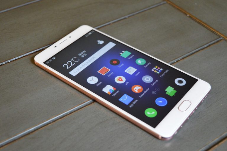
Meizu’s latest device, the M3 Max, embodies that trend, boasting a hefty 6.0-inch display. But does its performance under the hood match its giant look? We took the phone for a spin to find out.

Design
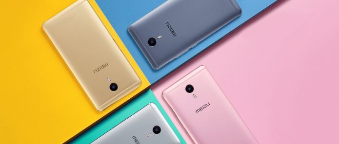
As has been the case with multiple Meizu phones we’ve reviewed over the past few months, the designers of this model clearly took inspiration from a certain fruity product — or in this case the Plus version of one. That this is a blatant iPhone copy isn’t necessarily a bad thing, however: The phone looks great. From its minimalistic, symmetric styling to the extremely thin, nice-feeling profile, the device really screams quality, at least when it comes to design.
…
Read full post here:
https://www.digitaltrends.com/cell-phone-reviews/meizu-m3-max-review/


