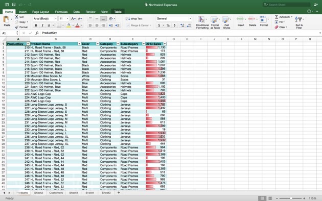
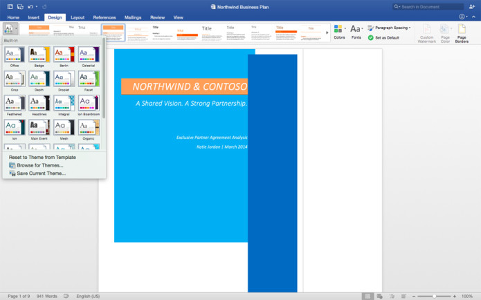
The last time a new version of Office for Mac came out, the year was 2010. Microsoft had recently released the Kin; our favorite e-reader had a QWERTY keyboard; and people were still snickering at some awkwardly named gadget called the iPad. A lot has changed since then: OS X looks a little different; Windows looks a lot different; and believe it or not, people actually want to use Office on that weird iPad thing. Until recently, though, Mac for Office looked the same as it did when it first came out on OS X Snow Leopard. Finally, earlier this year, Microsoft released a preview of Office for Mac 2016, which brings feature parity with the Windows version (Office 2013) and also better matches OS X’scurrent aesthetic. The final version is out today, and you can download it now for free — with an Office 365 subscription, or if you’re a student. What’s that, you say? You’d rather use Google Docs or OneDrive? You prefer Pages?! You can have a peek anyway at the screenshot gallery below, and then read on for a summary of what’s new.


Microsoft likes to say that its new Mac software is “unmistakably Office.” This is true: Office for Mac keeps the trademark Ribbon stretching across the top of the screen, except this time, it’s been reimagined to match the layout of Office for iPad. That means a generally flatter aesthetic, with a launch page for each app that lets you create a new document, open a local file or pick from a list of stuff you’ve worked on recently. For the first time on a Mac too, Office is integrated with Microsoft’s own cloud services (who’da thunk?), which means you can also open files stored on either OneDrive or a SharePoint site. Windows users have been able to do this since Office 2013 came out. Throughout, Microsoft also redesigned the various Office apps so that they’re optimized for Retina displays. As on Office for Mac 2011, you can use the apps at full-screen, except Microsoft switched to a different set of APIs, which — long story short — should make these transitions feel smoother than they used to.

As on Office for iPad, you can choose a colorful theme that has — you guessed it — a brightly colored menu bar for each app (e.g., blue for Word, green for Excel, red for PowerPoint). If you prefer, you can also opt for a so-called Classic theme, whose gray menu bar is more in line with the minimal design of OS X Yosemite and El Capitan. That said, if you have lots of windows open at once, you might like the option of being able to find each one at a glance just based on the color scheme.
A couple other new features permeate the new apps. When you make comments in Word or PowerPoint, they now appear as threaded discussions, instead of there being a chat bubble for each person’s contribution. This, too, has been around on the Windows side since Office 2013. Speaking of catch-up features, Office for Mac is also getting real-time co-authoring in Word and PowerPoint, which means you and someone else can be editing the same document at the same time. The only limitation is that there’s a paragraph lock keeping two people from editing the same paragraph at the same time. The winner? Whoever was there first.

It’s a similar story with each of the individual apps: There isn’t a single feature here that you haven’t already seen on Office 2013 or even Office for iPad. In Word, you get a “Design” tab in the Ribbon, along with a navigation pane on the left and a style pane on the right. In Excel, a “Recommended charts” feature suggests a chart format for your particular data set. The idea there is that there are so many chart types, but users don’t always know what’s best for their data. Moving on, most keyboard shortcuts will now work across both Macs and PCs, which is to say you can lead with the Ctrl key if you prefer. That said, Mac diehards can also stick with the Command button if that feels more natural.

Other enhancements in Excel include “slicers” to re-pivot data, a print-to-PDF feature, a full formula builder and improvements to autocomplete (i.e., entering data into cells). PowerPoint, meanwhile, gets a redesigned Presenter view that displays notes alongside each slide, and that’s consistent with the iPad and Windows versions. True story: Presenter view actually originated on the Mac, but was last improved on the Windows side. So we’re coming full circle here. In addition to that, Microsoft also added new slide transitions, as one does with a new version of PowerPoint, and also added a special viewing option that lets you see an overview of all the animations in your slide deck. There’s also a new conflict-resolution feature — a handy thing, given the new co-authoring tools.
There isn’t a single feature here that you haven’t already seen on Office 2013.
That covers the three biggies — Word, Excel and PowerPoint — but you also get Outlook for email as well as OneNote, which was not previously included as part of the Mac Office package. In Outlook, you can now propose a new time in the event you’re sent a meeting invite (previously, you could just accept or decline, which perhaps wasn’t the most helpful setup). Other long-overdue amenities include a unified inbox, conversation view, message preview and the ability to sync categories back to an Exchange server so that they’re not limited to your local machine. You can also see your calendar side by side with your inbox (this, too, comes in handy when someone sends you a meeting invite). As for OneNote, the new app comes on the heels of Apple unveiling its own revamped Notes app for OS X. The big update here, in Microsoft’s offering, is the ability to record audio notes, complete not just with timestamps, but also text markers, so you have a better idea of where to jump in.

Office 2016 for Mac is available today for Office 365 subscribers. If you’re a student, you can also go here to see if you qualify for either a free or a steeply discounted four-year subscription (it depends on what school you attend). Later in the year, Microsoft says it will offer traditional copies of Office, where you purchase it once instead of subscribe.
(engadget.com)


