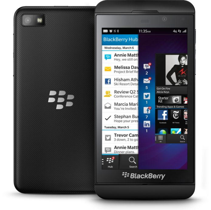
RIM reborn… and now it’s BlackBerry, if you don’t mind. Rebranded, refreshed, and desperate to impress, you can’t knock BlackBerry’s enthusiasm about its now-eponymous platform. Then again, it’s had several months of delays in which to practice, and theBlackBerry Z10 – first out of the gate to run the OS – is so close to the two prior variants of developer device that there isn’t a long list of new features to be learned. Instead, and with the arguably more important Q10 QWERTY version a couple of months off, it’s a case of making an argument for BlackBerry 10 to occupy the coveted “third ecosystem” spot, and the scraps left behind from Android and iOS. Is BlackBerry 10 the OS to give Windows Phone nightmares, reboot BlackBerry itself, and snatch both consumer and enterprise crowns? Read on for our full review.
Hardware and Design
Familiar and bland. The Z10 is a reasonably nondescript slab of black plastic and glass; as close to the sketched-in graphic of a “generic touchscreen phone” as you could imagine. BlackBerry was always keen to stress that the A and B versions of the Dev Alpha developer device were far from production-status, but bar a little aesthetic smoothing – the ridge around the display is gone, and the upper and lower front bezels are refined – this is the same identikit block as we’ve been seeing for months.
…
Read full post here:
https://www.slashgear.com/blackberry-z10-review-02267740/


