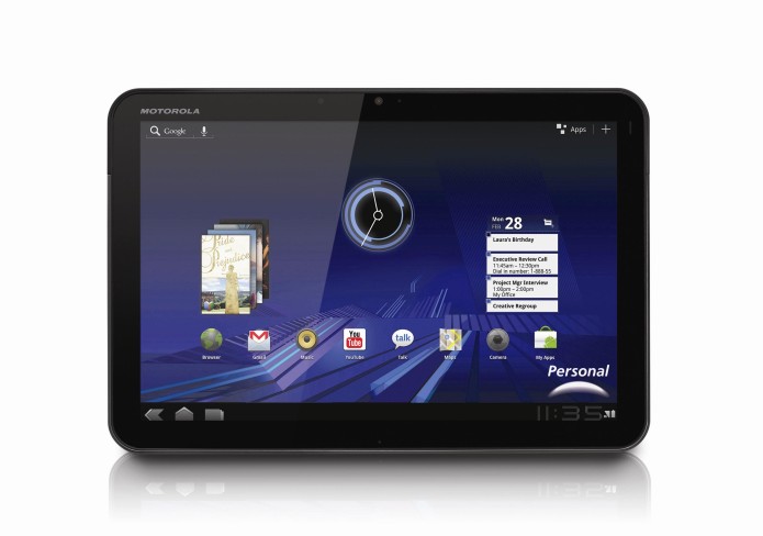
Motorola’s big launch of CES 2011 and the first Android 3.0 Honeycomb tablet on the market, the Motorola XOOM has a lot to live up to. In its haste to reach Verizon shelves, the XOOM could seem a little half-baked; it doesn’t get Flash Player support for another few weeks, and won’t have 4G until an update sometime in Q2. Still, as the iPad has shown, there are undoubtedly benefits to being first out of the gate, and there’s undoubtedly plenty on offer. Can the XOOM bypass pricing skepticism? Check out the full SlashGear review after the cut.
Hardware and Performance
Motorola’s design is sober and discrete, and where the iPad shows off its brushed metal the XOOM seemingly prefers to let the 10.1-inch display do the talking. It’s a 160dpi, 1280 x 800 WXGA panel with a capacitive touchscreen supporting multitouch gestures, and while it doesn’t use the same IPS technology as the Apple slate, it still manages decent viewing angles. We’ve had no issues with touchscreen responsiveness, though at 9.8 x 6.61 x 0.51 inches and 25.75oz it’s a somewhat heavy device, and one-handed use can get tiring.
…
Read full post here:
https://www.slashgear.com/motorola-xoom-review-23135670/


