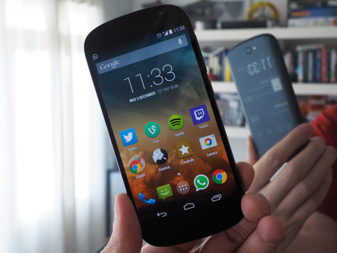
YotaPhone was inarguably one of the quirkiest smartphones released last year, with not one, but two displays. This curious marriage of LCD and E Ink was certainly a manufacturing achievement, but limited uses for the secondary screen meant it simply couldn’t live up to its potential. Undeterred, Yota Devices announced earlier this year it wascooking up a sequel, and today it’s ready to launch the new and improved YotaPhone 2. Its fresh design, high-end specs and bigger, higher-resolution displays are welcome upgrades, but most importantly, a thorough overhaul of the handset’s software means you can now make full use of the low-power E Ink screen, which has also been granted touch functionality for this generation.
I’ve spent a fair amount of time with the device, and have to say that it’s the most interesting smartphone I’ve ever used. Like its predecessor, the YotaPhone 2 is still very much a niche proposition with narrow mainstream appeal. That being said, Yota Devices has more or less achieved what it set out to do last year: Make a handset with an E Ink display that has several, legitimate use cases. Whether these will actually tempt you into picking one up is another matter, but the second screen is no longer an oddity; it’s an asset.


PROS
- Dual-screened engineering marvel
- E Ink screen is legitimately useful
- Gorgeous primary AMOLED display
- Top-tier performance
- Cool points aplenty
CONS
- Very expensive
- Limited mainstream appeal
- Mediocre camera
- Yota’s software still needs work
- Uncomfortable to hold the ‘other’ way around
…
Read full post here:
https://www.engadget.com/2014-12-03-yotaphone-2-review.html


