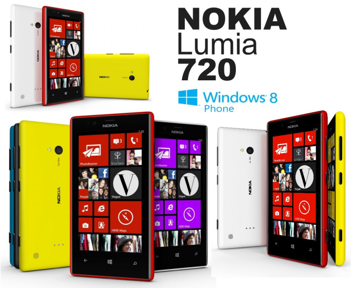
Nokia’s Lumia range is, depending on those you ask, either getting crowded or becoming more flexible, with the new Lumia 720 slotting in-between the 620 and the older 820. With its 4.3-inch screen adding up to a pocket-friendly size, the Lumia 720 makes a strong argument for the Windows Phone midrange. Still, we’ve already praised the Lumia 620 for punching above its station, so does the 720 really carve out enough of a difference to make it worth consideration? Read on for the full review.
Hardware
Nokia’s familial design language is clear in the Lumia 720, and it’s one of the more pleasing handsets to look at and hold in the company’s range. Narrower sides but wider top and bottom bezels make for a phone that’s slimmer but longer than the Lumia 820 it most closely resembles, though the 720 shaves 0.9 mm off the depth (taking it down to 9 mm).
…
Read full post here:
https://www.slashgear.com/nokia-lumia-720-review-18278211/


