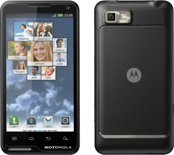
Motorola has been pushing the high-end in Android phones for a while now, coaxing early-adopters out of their shells with LTE marvels like the DROID RAZR and the DROID 4, but theMOTOLUXE shows it hasn’t forgotten the entry-level market. Solid and middle-of-the-road is usually the route for affordable devices; still, Motorola hasn’t been able to resist slapping a great big lamp on the front, just for some eye-candy. Is this the best budget Android phone around, or just a wannabe RAZR with a bad case of bloat? Check out our preview after the cut.
Hardware
For a “budget” minded device, the MOTOLUXE actually has some of the most successful industrial design we’ve seen from Motorola for a while now. There’s none of the clamorous title-chasing of the look-how-thin-I-am DROID RAZR, just a soft-touch monoblock which feels sturdy and creak-free. It’s a nice compromise on scale, too – the 4-inch display makes for a phone good for web-browsing and multimedia playback, but not so large as to monopolize your hand, pocket or purse. It’s important to note that this is a pre-final device – hence the preview, rather than a full review.
…
Read full post here:
https://www.slashgear.com/motorola-motoluxe-preview-08212571/


