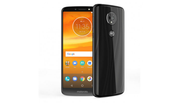
The Moto E5 Plus that launched today for Rs 11,999 can easily be called out as the Moto G6 if you’re not looking closely. At least I did at first glance. It has a similar 18:9 aspect ratio display, a shiny new body and a lot of other things common with its more expensive sibling. But then I looked closer and the differences started to become clearer. That’s not glass the Moto E5 Plus is made out of, it’s plastic shined to a point where it gives off that signature S-shaped shine Moto has developed. The display has increased in size, but the resolution has remained the same as its predecessor at 720p. The watch-dial shaped camera unit is the best disguise.
…
Read full post here:
https://www.digit.in/features/mobile-phones/moto-e5-plus-first-impressions-premium-design-at-a-budget-42124.html


