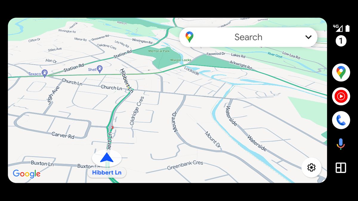

It seems there’s a visual revamp for Google Maps underway, which you might have already noticed on your phone – and the new color scheme being used on the maps makes the interface look a lot more like Apple Maps.Google hasn’t said anything officially yet, but 9to5Google and others (including some of the TechRadar team) have noticed the refresh. At this stage it’s not clear if the new look is being tested or is here to stay.Rather than white
…
Read more