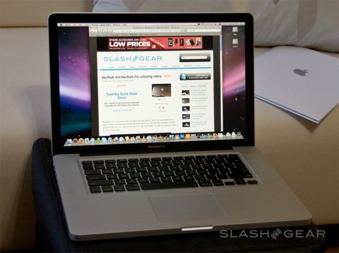
As Apple’s flagship laptop, the MacBook Pro arguably has an easier time than the MacBook. With a reputation of superlative performance and style, the Pro is targeted at an audience who, to stereotype a little, has higher priorities than budget than those looking at the MacBook segment. It’s a double-edged sword, though: since the last MacBook Pro refresh the laptop has faced fresh competition from Voodoo’s slick, niche range, as well as capable (if a touch more mainstream) models from HP, Lenovo and others. Apple’s retort is a MacBook Air-inspired casing and dual-graphics; is it enough to keep the MacBook Pro on top?
Design and Constructions
The two new MacBooks both share a common manufacturing technique, whereby solid chunks of aluminum are pared down until scant casings remain. It’s an alluring concept – a unibody, Apple call it, though of course there is more than one piece to the case as a whole – and a durable one, producing something more solid than just about any other normal notebook. To that aluminum start is added glass and backlit plastic; glass for the screen, a 15-inch 1,440 x 900 panel, and the multitouch trackpad, while the Pro’s keyboard takes the same design cues as that of the MacBook Air.
…
Read full post here:
https://www.slashgear.com/macbook-pro-review-late-2008-model-2019617/


